Tuesday, September 30, 2008

Remember WCMD is coming up

October 4th, this coming Saturday, is the day!

Card Makers everywhere can rejoice as we celebrate with paper, scissors, glue and all of the other supplies

you love to use.

Check out the schedule here at the WCMD web site, sponsored by PaperCrafts Magazine.

The magazine cover on the side here is a sneak peek of the give away I will have here for those who post a comment on Saturday on my blog.


I thought I needed to post a new card here today to celebrate a little early. The side view below gives you an idea of the plastic patterned paper that I used with a green paper card insert. The clear patterned paper is by Page Frames. It is printed when you get it, you can cut it any size you want and it folds for making a card.
The sticker letters, the rhinestone swirl and the flower and leaves are on the outside of the card. Thanks for visiting, Linda (lbpost)
GOD BLESS YOU card
Materials:Patterned Plastic sheet – Page Frames
Patterned paper – Sapid/Mellow/BasicGrey
Sticker letters – Maude/Mellow/BasicGrey
Felt Flowers and leaves – Creative Impressions
Rhinestone swirl – Prima

Sunday, September 28, 2008

Creating Backgrounds PART 4 - Sprays

Have you ever played with Prima Paintables? I love these things. What I love the most is the kind of paper that they have used, it is an amazing watercolor paper. It is the kind that allows you to play and play with water and it holds up well. I have even used the back of the paper when I wanted to watercolor my own image.
The above piece is the one that I used for my two cards. It has four sections of prints on this one sheet of paper making it the perfect backdrop to card making. I just cut it in fourths so I could work with each design separately.
The background in the card above took all of a minute to create! I just used my Memories Mists sprays. (I seem to be finding way too many things to create with them) I used the yellow and the red and sprayed the yellow first. The usual rule of thumb when working with different colors is to start with the lightest color first. I didn't want either color to cover the entire piece and these sprays are great for giving a nice, fine mist that lets you only color portions of your piece.
In this close-up, you can see the yellow with a fine mist of the red over that. I used my watercolor crayons and watercolor brush to add red to the middles of each of the flowers and I added an accent dot to each middle with the Inkssentials white pen. The little label was also lightly sprayed with the yellow so that it fit in better. To finish this fast and easy card off, I just added a punch out black chipboard piece from Cosmo Cricket. I just love using the black chipboard, it is so dramatic without any work. Mini brads accent the middles of the chipboard flowers.
For the above card, I got a little more involved with my sprays and accents.
If you look at my original piece, you can see that the crown is part of the pattern on the paper. I used the white, Inkssentials pen and accented the designs with lines and dots.
You can also see in these two close-ups how I kept the purple and the yellow sprays somewhat separate on the piece. A rub-on greeting and some various stamps stamped in a collage style finished the card off.
Thanks for visiting, Linda (lbpost)
BLESSINGS ABOUND card
Materials list:
Cardstock
Patterned papers – Prima Paintables
Bracket stamp – Inkadinkado
Label – K&Co.
Black Chipboard flower – Cosmo Cricket
Brads
Memories Mists sprays – Stewart Superior
White pen – Inkssentials/Ranger
White dimensional paint – Tulip
Rub-on words – Deja Views

MAGICAL-UNIQUE card
Materials list:
Cardstock
Patterned papers – Prima Paintables
Yellow Memories Mists – Stewart Superior
Purple Glimmer Mist – Tattered Angels
White accent pen – Inkssentials/Ranger
Rub-on word – Luxe
Word stamps – Wordsworth
Rhinestone

Saturday, September 27, 2008

The SUNDAY TIMES - 8.28.2008 - God's Word

Every part of Scripture is
God-breathed and useful one way
or another—showing us truth,
exposing our rebellion,
correcting our mistakes,
training us to live God's way.
Through the Word
we are put together and shaped up for the tasks God has for us.
2 Timothy 3:16 & 17 ( The Message Bible)

I just love coming across words or phrases that are so pictureque or poetic. When I came across this one phrase, "every part of Scripture is God-breathed", I was amazed at all that those simple words said. I already believed that the Bible is God's Word to me and you and meant to help us everyday. But that phrase instantly reminded me that they were more then just words on a page.

The New Kings James version puts that phrase this way..."All Scripture is given by inspiration of God". I am amazed that He cared enough about us to give us these words and all that they were meant to impart.
Thanks for visiting, Linda (lbpost)
Photo taken by me in Oregon

Thursday, September 25, 2008

Did you know there is a WORLD CARD MAKING Day???

If we can have a National Chocolate Covered Cherry Day (January 3rd), National Licorice Day (April 12th), National Bubble Bath Day (January 8th) and National Pancake Day (September 29th), just to name a few special days, then paper crafters can have a World Card Making Day!WCMD is next Saturday, October 4th. The festivities will be sponsored by PaperCrafts Magazine and they will be going on here, but you are going to want to check in at my blog too since I will have a neat giveaway. I'll talk more about this special day during the next week.

*

I am adjusting to the fact that FALL is upon us and so I thought I would show off a card today that is very fall related. You have to remember that I live in Southern California and it is pretty much just like any other summer day here right now!

I just love the mosaic look of this pumpkin stamp. I wanted you to see a close-up of the design in it and the way that I colored it.
I took my Marvy markers directly to the rubber and used a few different shades. When you do this, you just start with the lightest color you want to use. Then add a few coordinating shades of markers here and there. I spritzed the image with water when I had it all colored and stamped it.
Thank you for visiting, Linda (lbpost)

AUTUMN’S PALETTE card
Materials:Card stock
Patterned papers – Pumpkin Bead Board and Harlequin print/Bo-Bunny Press
Pumpkin stamp – Eureka Stamps
Marvy markers to color stamps
Fine water mister – JudiKins
Chestnut Roan Fluid Chalk stamp pad
Phrase rub-ons – Deja Views
Flourish rub-on – Mini Marks/American Crafts
Zig Zag scissors – Family Treasures

Wednesday, September 24, 2008

Bits of This and That

Can you tell where I went recently???
Yep, the beach.
Pismo Beach to be exact. I live in a city that is on the beach but sometimes a get-away is great and my first choice is still somewhere where I can walk on the beach.

It was a really low tide and so getting some pics of the expanse of the sand and waves was so cool and there were a few shells but mostly broken sand dollars.

You can see where I was at sunset! I love to try to get photos of the sunset although it is pretty hard to get them to work out. I had fun playing with different settings to see what would work the best.

And, thought I should share a photo of my 11 year old granddaughter playing with her little brother. He is 5 months old now and pretty much thinks that she is just plain neat!

Thanks for visiting, Linda (lbpost)

Tuesday, September 23, 2008

Sketches and Stamping

I seem to go in spurts on the techniques and supplies that I love to use and for some reason it seems that I am loving stamps and picking them up far more often for my accents.
For Card Positioning Systems blog this week, Clear Artistic Stamps was our sponsor so it was natural that I would incorporate the stamps they sent me in my card for the sketch.
I wanted to keep my card very simple, keeping with the sketch, so that I could really show off these simple stamps. To keep it even more simple, I "colored" a piece of white cardstock first by rubbing it with a Fluid Chalk stamp pad. I was careful to not completely cover my paper with the color but to let the lines of rubbing the pad the length of my paper show through. I thought that gave it kind of a "bamboo" look.
To give the images further accent, I inked the single butterfly stamp and "stamped it off" so that there were just shadows of the butterfly on my papers. "Stamping off" means that I stamped the butterfly more then once after inking it instead of giving it a fresh coat of ink each time. I didn't even stamp it the first time on my paper so that I wouldn't get an intense image but a shadow one.
Next, I just had to use the Laura's sketch #9 at 2 Sketches 4 You sketch for this week! The minute I saw the sketch they put up on their blog, I was reminded of the bracket set of stamps I had just purchased by Inkadinkado. One of the brackets in the set was LONG and I knew it was just going to fit perfectly with the sketch. I embossed it with black embossing powder to give it a strong, classy look.
I also knew I just had to use that black, herringbone print by October Afternoon, so those two elements were the foundation of my card with splashes of some complimentary colors.

Thanks for visiting, Linda (lbpost)

REAP THE JOYS card
Materials:
Clear Artistic Stamps
Cardstock Patterned paper – Scenic Route

Ancient Page and Fluid Chalk stamp pads – Clearsnap

Watercolor crayons

Circle punches – McGill

FORGET ME NOT card
Materials list:
Cardstock
Patterned papers – October Afternoon
Bracket stamp – Inkadinkado
Flower – Prima
Pearl Brad – Gartner
Black tag – Making Memories
Black stamp pad and black embossing powder – Clearsnap
Fluid Chalk stamp pad – Clearsnap

Monday, September 22, 2008

Creating Backgrounds - Part 4 - Brayer Fun

Have you even played with a brayer? Maybe you don't even know what one is. Maybe you have one sitting there that you haven't picked up. There are actually a number of techniques that can be done with them and I would like to cover one of my favorites today. There are also a number of different brayers, mine is a Speedball. These have been used for years in printmaking.
#1. I love to use these Kaleidocolor stamp pads with the brayer. The reason is that they are multi-colored and these particular pads have some rather clever features that make them long lasting and easy to use. This photo above is the pad as it looks when you remove the lid. The colors are stored "separate". In the past, multi-colored pads were just one pad with different colors on them and it wasn't long and the colors would just run together, making for a rather muddy look. These pads have a lever that separates the colors, you can't put the lid back on without pulling the lever to separate them.
#2. When you go to use the pad, you push the lever and the colors are pushed together to form one solid pad. In the photo above, you can see the pad with the colors pushed together and you can see how I have placed my brayer on the pad. You want to ALWAYS place the brayer back in the same direction on the pad. So, the end that started on the green end, always needs to be placed back on the green end. If you reverse the brayer or a stamp you are using, you will transfer the colors onto each other and that doesn't work well. If you do that (I am speaking from experience here) you can take a cloth and just wipe the pad and alot of that transfered color will be removed.
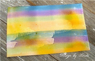
#3. I like to completely cover the brayer with colors by running it over the pad several times and then I use a small, misting bottle and spray the brayer. You can see by the above photo, the look that comes with the water and the inks mixed together. I am also using glossy paper here. This also works with uncoated or matte papers and I will show some of that later.
#4. Here is a piece of paper with the brayer run across the paper with two widths of the brayer, so it is run across twice. I only ran the brayer across once too but you can continue to re-ink it and run it across over and over until you have the color you want. I wanted to make sure that my inks showed well as they ran with the misting of the water.
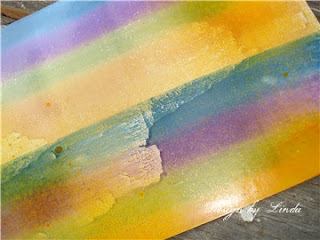
The photo above shows a good close-up of that paper and the effect.

When you have your paper colored, there are a number of things that can be created with the finished and dry multi-colored paper.
For the card above, I just stamped a stamp over my colors using black ink. This stamp has all of these images in one piece.
I added some Glitter Fabric Dimensional paint to the flower portion only, I think you can see a little bit of the sparkle in this photo and another interesting thing is that the paint "raised" the paper in that area so it has an embossed look to just the flower.
One of my favorite things it to just stamp a background design over the colors. This leaf swirl stamp was a great choice with these fall colors.
I also used some of my colored paper to stamp my greeting and notice that I stamped the greeting with the line of colors going in the opposite direction of the colors on the background.
Thanks for visiting, Linda (lbpost)
SING TO THE LORD… card
Materials list:
Glossy cardstock
Cardstock
Creole Spice Kaleidocolor stamp pad – Tsukineko, Inc.
Leaf background stamp – Inkadinkado
Verse stamp – Printworks
Black stamp pad - Versafine

FIRST GRADE card
Materials list:
Glossy cardstock
Cardstock
Patterned paper – BoBunny Press
Bouquet Kaleidocolor stamp pad – Tsukineko, Inc.
First Grade stamp – PaperBag Studios
Black stamp pad – Versafine
Glitter Fabric Dimensional paint – Tulip
Machine sewing
Scallop scissors

Saturday, September 20, 2008

The SUNDAY TIMES - 8.21.2008 - God's Guidance

Trust God from the bottom of your heart;
don't try to figure out everything on your own.
Listen for God's voice in everything you do,
everywhere you go;
He's the one who will keep you on track.
Proverbs 3:5 The Message Bible
You probably recognize this verse. You have probably repeated it many times if you have memorized any Bible verses. The last part is more familiar as "In all your ways acknowledge Him and He will direct you paths" (NKJ).
When these words came to my mind this week, I was wanting to reflect on depending on God to direct my paths or keep me on the track that He knew was best for me and as I was recalling the entire passage, I thought again of the other steps that are required in wanting God's guidance.
First, I need to trust Him! REALLY trust Him! Next, I need to not try to figure everything in my own understanding. I too often only have part of the information needed to make correct choices. Even if I pray, I still might tend to think I know how God should answer something.
If I want His guidance then I also need to trust how He thinks things should go down! OHHHHH that can be hard! And, do I then "listen" for His voice? Perhaps I try to get up and go on my own way. What I so enjoy about having verses like this memorized is that I can then stop and take a deep breath and put my life back in His hands.
Thanks for visiting, Linda (lbpost)
The photo was taken by me at a friends ranch

Thursday, September 18, 2008

Got Some Fun Accents????

For the Kazan's Sketch #9 at 2 Sketches 4 You this week, I cut out a Flocked flower from my patterned paper by Best Creations.

You can see that I used a Cuttlebug embossing plate for my background piece and I then used my Scor Pal tool and added in some lines across my background. These lines across the card mimic the lines that are on the sketch. I lightly rubbed a green Fluid Chalk stamp pad across the raised portions of the embossing to give them a little accent. For the YUM piece of accent here, I cut out a Black, Flocked flower from a piece of Best Creations paper.
The close up of the embossing gives you a better idea of the lines that go across the card that were created with the Scor Pal. The reason this worked so quickly and easily is that the Scor Pal has all kinds of measurements to use for scoring and so in under a minute I had the exact lines picked out so that everything was centered.

For the next card:
I was shopping in an antique store this summer and there was a booth with a little basket full of little baggies of snips and pieces of trims. Wonderful, yummy trims. The price was right and I knew that I just had to pick out some bags. This card shows off one of those pieces. The white, lacy piece on the front of the card is the exact size as it came in the package. Doesn't this make for just a super cool accent?

You can see in the close-up a little better view. The lacy flowers had open middles in each one so I just used that space for mini brads and they hold my piece in place. I accented the patterned paper with Metallic 3-D Fashion paint by Tulip for a faux pearl look.
Thanks for visiting, Linda (lbpost)

BEST WISHES-LACE card
Materials: Solid Cardstock
Patterned paper Devotion and Sweets/Blush Collection/BasicGrey
Scallop punch and circle punch – Marvy
LaceMini brads – Creative Impressions
Stamps – Crafty Secrets
Fluid Chalk and Ancient Page stamp pads – Clearsnap
Machine sewing
Metallic 3-D Fashion paint - Tulip

BLACK FLOCKED FLOWER card
Materials list:
Cardstock
Patterned paper – October Afternoon and flocked flower cut from Dancing Leaves/Best Creations
Cuttlebug embossing plate – Provo Craft
Fluid Chalk stamp pads – Clearsnap
Ribbon
ScorPal for embossed lines

This Just In......

Today was my day to post a project at Pursuit of CraftYness so I did another project with the Kitchen Sink Daisy stamp set and some tips on stamp pads, etc.

Take a peek:
The Art of Stamping Flowers

Thanks for visiting my blog and the Pursuit of CraftYness blog, Linda (lbpost)

Wednesday, September 17, 2008

So You Think You Can Stamp contest

I already mentioned this, but I thought I would post my layout for the contest here and give you a good peek at a close-up of those YUMMY flowers! The voting is still open until Thurs at noon and I understand you can vote for more then one entry. There will be several stampers who will move onto the next phase with more voting next week.
Voting here - So You Think You Can Stamp contest

This is my granddaughter when I caught her using her mom's camera. It is so fun to see the interest in photography being passed on to my kids and then to their kids.
I wanted to give you a real close up of the flowers. I used this great set by Kitchen Sink Stamps. She has several sets of stamps that are referred to as 3-step stamps but if you count stamping the middle to this larger Daisy, there were four steps. Each layer of stamps just adds more and more details to the image, each time using darker stamp pad colors. And for these flowers I used Worldwin papers, Treasures cardstock in white and you can see the "canvas" look that gives to the flowers.
Thanks for visiting, Linda (lbpost)

YOUR VIEW layout
Materials: Cardstock
Patterned paper – HomeTown collection/October Afternoon
Kitchen Sink Stamps – Daisy 3-step set
Memento stamp pads
Vivid stamp pad
Marvy stamp pad
Ranger Distress stamp pad

Tuesday, September 16, 2008

CPS Sketch #82 and more on alcohol inks

First - you can see a little tutorial that I put together for the magazine, Scrapbook & Cards Today using alcohol inks. This is part #1 and part #2 comes next week.

Second - don't forget to vote at Simple Scrapbooks, So You Think You Can Stamp contest - voting open until Thursday noon.

Next - this is my card for Card Positioning Systems blog for this week and you can see more ideas for using alcohol inks. This time I dropped two colors on these sheer flowers by Maya Road and "moved" them around a little with the Blending Solution. Worked like a charm!!!
The other good news about the sketch this week is that the team worked with a new sponsor, Kandi Corp! They offer a few pretty interesting products but what we played with this week is their heat tool that sets their crystals. Another cool thing about this took and the crystals is that they will work on other surfaces besides paper.
Thanks for visiting, Linda (lbpost)

HOORAY FOR YOU card
Materials:
Kandi Corp Hot Fix tool and crystals
Cardstock Patterned paper – Sassafrass Lass

Sheer flowers – Maya Road
Alcohol Inks – Ranger
Fluid Chalk stamp pads – Clearsnap
Greeting stamp – Hero Arts

Monday, September 15, 2008

Creating Backgrounds - Part 3

This post today is kind of two fold.
ONE - this layout is the one that I entered into the first phase of Simple Scrapbooks "SO YOU THINK YOU CAN STAMP" contest
and TWO - is that I wanted to show how quick and easy it was to create my own patterned paper.
As a finalist in the first phase of the contest, I needed to create a new layout that will be posted starting today sometime at Creating Keepsakes web site and the viewing audience will get to vote on the entries as to which designers will go on to the next step.
The voting starts today at noon at Simple Scrapbooks contest http://stampcontest.blogspot.com/
Hold onto your hats because the entries are amazing. Remember my name is lbpost and I guess you can vote for more then one entry!!!
Back to the quick and easy background. This one literally took minutes.
1. On plain white cardstock, I repeatedly stamped the flower stamp with black ink. I didn't want the paper to have too many flowers on it so I did space them out a bit.
2. I took a white crayon and colored the middles of all of the flowers. On the white paper, that is almost impossible to see, but you can see the shine of the white crayon because of the wax. This is going to create a resist to the colors we are going to add.
3. When all of the flowers were stamped and all of the middles of these flowers were colored with the white crayon, I took the yellow bottle of the Memories Mists spray and sprayed that over my piece of stamped paper. I wanted varying amounts of yellow over the paper so some areas were heavily sprayed, others slightly sprayed. 4. Next I took the red bottle of Memories Mists and sprayed that over my paper. Again, I wanted the coverage to be varied so the red is sprayed so as to not cover the entire piece.
5. Give these mists colors a minute to dry and then blot the spray off of the middles of the flowers. I say to blot them first because you don't want to smear these colors over your sprayed background.
6. When you have the extra paint off of the middles, now buff these areas with your cloth. The more you buff it, the more the wax will be exposed, revealing the underneath color. You can easily see at this point how the crayon wax did resist the paints. You can see on the layout that I stamped some extra flowers to cut out as accents. (This was my entry for the first phase of the contest, a new layout is up starting today)

Thanks for visiting, Linda (lbpost)

Materials:

Scenic Route flower stamp and patterned paper

Heidi Swapp and Kim Hughes (CHF) word stamps

White Crayon

Memories Mists sprays - Stewart Superior

Black stamp pad

Martha Stewart border punch

Saturday, September 13, 2008

The SUNDAY TIMES - 8.14.2008 - A Neat Prayer

We ...... pray that our God will make
you fit for what He's called you to be,
pray that He'll fill your good ideas
and acts of faith with His own energy
so that it all amounts to something.
If your life honors the name of Jesus, He will honor you.
II Thessalonians 2:12 The Message Bible

I read this verse this week and I had to smile when I read the part about "your good ideas". My love of crafting came to mind. Yes, I believe that God cares about every part of my life, even my love to create with paper and ink, etc. I know that I am regularily praying that I will honor God with my life and that even my crafting and creating will honor Him. This verse just somehow validated that idea for me!

Thanks for visiting, Linda (lbpost)

I took the photo of this amazing flower as we walked through a garden. It is somehow my attempt to hold onto SUMMER!!! I'll have to admit soon that it is time for FALL!

Thursday, September 11, 2008

It's sketch time again

Card Positioning Systems blog - Sketch #81 - ScraPerfect Sponsor
This week at CPS, ScraPerfect was the sponsor so each of the team members had the opportunity to see what this little pouch would do to improve stamping or printing. For my card, I ran the pouch over my green paper before I stamped my image and poured the embossing powder on it. Some papers and powders just seem to have a whole lot of static which makes for "stray" flecks of the embossing powder to stay on your paper and potentially ruin your image when you heat it. I would say that I didn't have ANY stray flecks after using the ScraPerfect pouch.
The close-up shows how crisp and clean my images are and I also wanted to show you my "faux" pearls. I used Plaid's Metallic Dimensional Fabric paint. The container has a tiny tip where the liquid comes out so you can get small dots like this and when the metallic paint dries it look like pearls.
This card uses last weeks, 2 Sketches 4 You, Kazan's Sketch #8 and I Am A Scrapaholic's September kit. If you like to doodle, this is the kit for you! I used my Sakura 3-D Glaze pens to give added accent to the doodles on the papers and punch outs.
This is Laura's Sketch #8 from 2 Sketches 4 You for this week. There are a couple details on this card that make it fun. One is that the flower print is actually a photo that I took in a friend's garden. I printed it on a textured, white cardstock.
Now sure if you can see the other interesting feature of this card, but I sprayed it with a green, Glimmer Mist. I sprayed the entire front of the card with the Glimmer Mist. It gave such a neat look to all of the papers and kind of tied them together.
Thanks for visiting, Linda (lbpost)
THE BEST IS YET TO COME card
Materials:
ScraPerfect – The Perfect Printing Pouch
Cardstock – Core’dinations
Two different background stamps and phrase stamps – Anna Griffin/All Night Media/Plaid
White stamp pad – Joann’s
White embossing powder
Flourish stamp – Memory Box
Metallic Fabric Dimensional paint – Plaid
Fluid Chalk stamp pads – ClearsnapMachine sewing
DOODLE-SWEET card
Materials list:
Cardstock - Prism
Patterned paper – Pop Star/7gypsies and orange paper/We R Memory Keepers
Punch out elements – 7gypsies
Glaze pens – Sakura
Alphabet stamp – Stampin’ Up
SERENITY card Materials list:
Cardstock – Core’dinations
Patterned paper – Pink Paislee and Scenic Route
Flower and leaf stamp – Magenta
My own photo
Rub-on word – LUXE
Glitter brad – Doodlebug
Tonic Paper Distresser
Green Glimmer Mist – Tattered Angels

Wednesday, September 10, 2008

Want some BLING!?


Bling seems to be where it's at these days. I love BLING and I love that there are so many ways to get some serious BLING or some subtle BLING. I was able to get my hands on these adorable little bottles of SHIMMERZ paint this week and of course, I had to try it on a project immediately. They come in a number of colors and all you need to do is use a paint brush and add it to your project. I'm going to try out some other techniques but this is the easiest and most obvious.

I stamped the flower and vine stamp on white cardstock with black ColorBox ink and embossed it with black Top Boss embossing powder. I didn't need to emboss it but I wanted my black lines to be as intense as possible and by embossing the image, I created little "walls" so to speak to help contain my colors. These paints wouldn't have flowed all over if I didn't have the "walls, I just think it helps with the overall look.
I let the sun shine on my colored image so that you could for sure see the BLING that comes with the Shimmerz Paints. I also stamped and colored the flower twice and cut one out so that my image is more 3-D. You can also see the embossed dots. I used a Cuttlebug embossing plate and the green paper is Core'dinations so I slightly sanded my embossed dots to reveal the underneath color of the paper.

Thanks for visiting, Linda (lbpost)

FRIENDS cardDesigner:

Materials list:
Cardstock – Core’dinations
Patterned paper – Deja Views
Flower and leaf stamp – Magenta
Friends stamp – Cornish Heritage Farms (Kim Hughes collection)
Black ink – ColorBox/Clearsnap
Black embossing powder – Top Boss/Clearsnap
Shimmerz paints
Swiss Dot Cuttlebug embossing plate – Provo Craft
Silver dot – Michaels