Thursday, September 30, 2010

Apples and Smiles

A challenge this month to the design team at Nikki Sivils, Scrapbooker was to create a "back to school" related project. All of the teams projects were posted today on the Nikki Sivils blog so be sure to take a peek.

I had just received my new Better  Homes and Gardens magazine and they listed some templates and ideas that were online with access to crafters and I knew this really cute and clever accordian style apple card would work for my creation.  Here is a link to this template and you just might find other things there to use too.

I pulled out my Henry's Brilliance papers and die cuts for my card.  The base is cut from Core'dinations cardstock.   The apple shaped patterned paper pieces are inked with a Fluid Chalk stamp pad.

And for even more goodness, the Core'dinations blog is featuring the BRAND NEW Stacy Julian Core Impressions cardstocks that were released at summer CHA.  I wanted to share one of my projects, a layout where I used a piece of blue with swiss dot embossing and a piece of yellow that has embossed words in it. The words are repeated on one piece of paper in little blocks so they were perfect to use as accents to these adorable photos of our youngest grandson with some pretty BIG smiles.  The patterned paper is Jillibean Soup. 

Thanks for visiting, Linda (lbpost)

APPLES – Hey Wise Guy card

Materials list:
Pattern – Better Homes and Gardens web site - http://www.bhg.com/holidays/thanksgiving/crafts/easy-thanksgiving-cards-table/?page=2
Cardstock – Core Impressions/Core’dinations
Patterned papers and die cuts – Henry’s Brilliance/Nikki Sivils, Scrapbooker
Alphabet letters – Nikki Sivils, Scrapbooker
Fluid Chalk stamp pad - Clearsnap
Sandpaper

Wednesday, September 29, 2010

The Floral Flower Soft blog hop

The Flower Soft Design Team is hosting a blog hop today (Wednesday the 29th) and the theme is Floral or Flowers.  What a great theme and how much fun to add in some Flower Soft goodness with it.
There will be TWO prize packages!
One prize package will be given away on the blog hop.
 Another will be chosen among people who make a card
using Flower Soft and post it in the
Splitcoast Gallery using the keyword FSC05.
Both prize winners will be chosen and announced on the Flower Soft blog on October 6th.
The winner of the Splitcoast Gallery challenge will have their card featured on the Flower Soft Blog on 8th!!!


If you didn’t start at the beginning of the hop please go to the beginning at the Flower Soft Blog.

As you make your way through the hop make sure you comment on each and every post. There will be a prize winner chosen randomly among the blogs.
The prizes (one set for Splitcoast players and one set for the blog hop!) :
Moments in Time Stamp set Little Friend
Polar White
Ultra Fine Strawberry Flower Soft
Flower Soft Glue

I tried something new-to-me on my card for the hop.

I used a piece of woodgrain embossed Core'dinations cardstock for the base of my card.  I followed the Get Sketchy card sketch for the design of my card.  To keep with the theme of Floral/Flowers, I added punched circles to match the sketch and glued small flowers to the middle of each punched circle.   
I love to experiment so I pulled out my Scotch Double Sided tape.  I taped it to a strip of paper and started sprinkling the Citrus Crush and the Toffee Ultra Fine Flower Soft to that.  I then "pressed" the Flower Soft into the tape.  I kept adding more Flower Soft onto the tape and kept pressing it into it until I felt it was thoroughly "filled".  I still wanted a little more Flower Soft on my tape so I took the Tacky Glue and added some here and there along my tape and added the Sunshine Yellow Flower Soft in the wet glue.

Next, hop of over to Dina Kowal's blog where you will find the cutest creation using Flower Soft. 
(Want even more inspiration? Do you like video tutorials? Make sure and visit Flower Soft TV!)


Thanks for visiting, Linda (lbpost)

HEARTFELT WISHES card

Materials list:
Citrus Crush and Toffee Ultra Fine Flower Soft and Sunshine Yellow Flower Soft
Tacky Glue – Aleene’s/Flower Soft
Double-sided Scotch tape
Cardstock – Core Impressions/Core’dinations
Flowers – Recollections
Sentiment stamp – Savvy Stamps
Black Versafine stamp pad
Circle punch - Papershapers
Sandpaper

Tuesday, September 28, 2010

Sketches and Color Combos make my day!

The Play Date Cafe Challenge, the Card Patterns sketch, NEW Stacy Julian Core Impressions Core'dinations cardstock and the 2 Sketches 4 You sketch! How does it get better???? All of these are in my post today.

PLUS....Jillibean Soup papers and their blog.
I was soooo happy to be able to be one of their guest designers and my projects are up today for all to see.  I'll post all of them here on my blog on another day so I can share close-ups of some of the details.  Be sure to check this out though over at the Jillibean Soup Blog.

I'm going to start with The Play Date Cafe Challenge.  I would NEVER have thought to put these colors together, yet when I did as I played along, I LOVE this color combo and I would even want to make another card with it.
This little strip of Jillibean Soup paper really helped me pull this together plus the blue and the gray Core'dinations cardstock.  I used the Card Patterns sketch to give me direction on my design.
I used this wonderful scripture verse stamp by Verve.  I want to make more cards with Bible verses on them because they are the best for sending to a friend just to say HI or as an encouragement.  The frame is a $1 spot stamp.
In case you missed this announcement, Core'dinations and Stacy Julian came out with a collection of Core Impressions cardstock for Summer CHA.  All of the embossed designs are already in these papers.  Here I just used two of them.  The Core'dinations blog is showing off examples using these cardstocks all week so be sure to check that out.  I used the 2 Sketches 4 You sketch for my card. 
All I did to help show off the embossed designs is to slightly sand them.  This is just one piece from the collection that has words all over it.  They fit for so many themes.  The little clouds are cut from a piece of Cosmo Cricket patterned paper.

Thanks for visiting, Linda (lbpost)

Saturday, September 25, 2010

From Spiders to Santa

To show off my Unscripted Sketch card and my Card Postioning Systems card for this week, we will start with Spiders and end with Santa!

This is the Unscripted sketch card.  I just picked up this really cute spider web with a tiny spider stamp set in the $1 spot and so I paired them with some Nikki Sivils, Scrapbooker papers.  I don't usually do a whole lot for Halloween but I thought this was pretty irresistible. 

The green cardstock is embossed with a Tim Holtz embossing plate that has a web look to it so I thought it was a good match.  I accented the spider web with Glitter 3-D Fashion paint by Tulip to give that web a little bit of bling.
Now for my CPS card.  Flower Soft is the sponsor this week at CPS and so I pulled out some cute stuff for my card.  I used another Tim Holtz embossing plate for that checkerboard look on the white cardstock.   
Not only did I accent my Santa with Teddy Bear image with Flower Soft, the image itself and the red, print, background paper is by Flower Soft too.  Let me tell you, I used one of their Cute Christmas Papercraft CD's and you could never even use all of the images and papers in this CD and it is soooooo easy to use. If you aren't sure what to do with it, you can watch a little video at Flower Soft TV where they walk you through the very easy steps.  There are a number of cute images and they come in several sizes so they fit your project but there are also many different options for patterned papers and every single paper can be printed in more then one color. WOWIE!
I used the JPEG option for this Santa with Teddy Bear and that meant that I could print it the size I wanted.  That was cut to match the sketch and then the Polar White Flower Soft was added to the Santa. I am pretty sure that is my favorite color in the Flower Soft collection.  The Teddy Bear has a little bit of accent with two brown colors. 

Thanks for visiting, Linda (lbpost)

SKETCH 74 – SPIDER WEB card

Materials:
Cardstock – Core Expressions/Core’dinations
Patterned paper – Boo-tiful/Nikki Sivils, Scrapbooker
Web and Spider stamp – Inkadinkado
Black Versafine stamp pad
Clear embossing powder – Stampendous
Tim Holtz Sizzix embossing folder
Circle punches – Marvy
Glitter 3-D Fashion paint - Tulip
Sandpaper

SKETCH 186 – SANTA AND BEAR card

Materials:
Flower Soft and Ultra Fine Flower Soft – Courtesy of Flower Soft
Cute Christmas Papercraft CD Rom – Courtesy of Flower Soft
Tacky Glue – Flower Soft
Cardstock – Core Expressions/Core’dinations
Tim Holtz Sizzix embossing folder
Sandpaper

Tuesday, September 21, 2010

That splash of RED!

I love working with color challenges but let me tell you, this one by The Play Date Cafe is over-the-top.  Not sure what I like most about this, the photo or that splash of red. 
In fact, the photo is one I would have taken if I had seen this adorable little house.

 Now, add to this wonderful color combo that the sponsor for TPDC this week is PaperBag Studios.  I have a couple of their stamps, so of course, I pulled them out.  Somehow that embossed, Core'dinations cardstock reminded me of the roof of the house and the white punched border reminded me of that cute little fence. 
I like this stamp because of the collage way the elements are put together on it,  but also because when you stamp it with black ink, there are a number of ways that you can add color.  Here I masked off part of the design so that I could spray the one side with red ink.  I colored the flower with Copic markers and added a coat of Aleene's Paper Glaze, so the flower stands out a little bit. 

A long time ago, I used this stamp in another way  and I thought I would show you that one as well.  The background for this one was colored by running a brayer across a multi-colored stamp pad.  This works best with glossy cardstock but matte will work too. This is a fun way to create a background. 
Here is a little glimpse of what I mean by that.  The brayer is ran across the paper until a solid coat of color is applied then the image was stamped over that with black ink. 

Thanks for visiting, Linda (lbpost)

ABC - SISTERS card

Materials list:
Cardstock – Core Impressions/Core’dinations
ABC – Sisters stamp - Paper Bag Studios
Black Versafine stamp pad
Clear embossing powder - Stampendous
Copic markers
ChalkBoard spray – Tattered Angels
Red Spray color – Memories Mist/Stewart Superior
Clear Paper Glaze – Aleene’s®
Self adhesive pearls- Queen & Co.
Border punch – EK Success
Sandpaper

Monday, September 20, 2010

A Stamp here and a Stamp there

Todays post is about some really fun stamps. Fun in design and fun to use.
The first card I want to share is this cutie created with My Stamp Box stamps.  Core'dinations cardstock and My Stamp Box did an exchange and this is one of the cards I put together with these stamps. I LOVE this set of stamps, how does it get better then patterned clouds! Be sure to check out both of those blogs, Core'dinations and My Stamp Box, for more ideas, both teams created cute stuff and there are prizes to be had by leaving comments on both blogs.
For this card I did an exercise with masking
If you don't know what masking is, it is a technique that allows you to stamp more then one image and have one look like it is "behind" the other or one "on top" of the other, whichever way you look at it. 
1.  I stamped the sun first. 
2.  Then I stamped the sun on a piece of copier paper (you need a thin paper for a mask).  I cut that extra sun out.  Now that cut out sun is placed over my original sun and one of the clouds was stamped, inking it with black ink.  Where the sun mask is, the cloud image will not stamp and when the sun mask is then removed, you will see the sun looking like it is "on top" of that cloud. 
3.  I then made a mask of the first cloud, I placed the sun mask and the cloud mask over the images I had stamped and I stamped the second cloud.  Now my sun and the first cloud look like they are "on top" of the second cloud. 
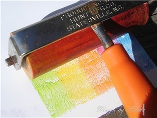
4.  I kept those two masks in place and sprayed my white cardstock with some Glimmer Mist spray, first a blue Chalkboard spray and then a blue Glimmer Mist spray to create my "sky" behind the sun and clouds.  This kept the spray off of the sun and clouds. 

The sun is accented with a little bit of Glitter 3-D Fashion Paint for just the right amount of glitter.

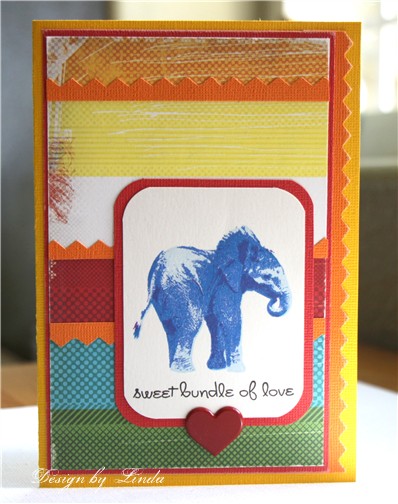
Next I want to share my Card Positioning Systems card for this week.  The sponsor is Kitchen Sink Stamps.  If you are not familiar with that company, it is known for it's 3 or 4 step stamping process.  I just don't even know how she does it, but by stamping the layers, you keep adding details that are pretty hard to believe are stamps. 
This is one of her brand new stamp sets.  This little elephant is just too adorable.  I chose to stamp it in shades of blue so that it would fit for a baby card.  The set comes with a number of adorable little sentiments to go with it.  I just love the font she uses. 
One thing about using these stamps is determining what colors to use for the layers.  It works best to start with a very light shade and then each additional layer should be darker and darker.  For my last layer on this little guy, I used a purple that really helped define the cute details.  I listed the exact shades I used in my materials list.
Thanks for visiting, Linda (lbpost)

RAINY DAY? card

Materials list:
Cardstock – Vintage and Core Essentials/Core’dinations
Curious Iridescent Cryogen White/CutCardStock.com
Clouds, sun and sentiments stamps – My Stamp Box
Black Versafine stamp pad
Clear embossing powder
Tattered Angels – Glimmer Mist and Chalkboard
Sandpaper
Self adhesive rhinestones – Queen & Co.
Copic markers
Glitter 3-D Fashion Paint – Tulip


SKETCH 185 – SWEET BUNDLE OF LOVE card

Materials:
Cardstock – Core Expressions/Core’dinations
Elephant and sentiment stamps – Courtesy of Kitchen Sink Stamps
Patterned paper – Cosmo Cricket
Versafine black stamp pad
Memento stamp pads - 1. Summer Sky, 2. Bahama Blue 3. Danube Blue 4. Grape Jelly
Heart brad - Recollections
Corner punch – Martha Stewart
Sandpaper

Friday, September 17, 2010

It's beginning to look alot like FALL!

I didn't know how hard it would be to create a card with all of the same color family!!!

The Unscripted sketch for this coming week has a piggyback challenge with it - create a monochromatic card.  In other words, stay within one color family.  Do you know what I wanted to reach for first? A multi colored patterned paper!!! But, instead, I reached for this brand new Core Impressions cardstock by Core'dinations.  It is from the new Graphic 45 collection. It is YUM! That great embossed design comes in the cardstock, all it takes is a little bit of sanding.  I let that piece set the stage for my card. 
Next, I picked up a little chipboard house that I had in my stash from Maya Road.  I covered that with a striped piece of paper from BasicGrey, just the perfect combination of colors to stay within the same color scheme and to also fit with the Color Que color challenge at Wplus9 Designs.  The little "home" piece is a rub-on by Jenni Bowlin. 
This last week, it was my turn to post some projects at the Nikki Sivils, Scrapbooker blog.  In case you missed that, here is one of the cards that I shared.  The papers are from the Boo-ti-ful collection. I just plain love that Nikki added purple into this Halloween/Fall collection of papers. 
The pumpkins are part of one of the full size patterned papers.  My card combines pieces from the mini paper pads and the full size, 12" x 12" pieces. 

Today is also my day to post at the Flower Soft blog, so pop on over to see the entire card that I added bits of the Citrus Crush Ultra Fine Flower Soft too.

Thanks for visiting,  Linda (lbpost)

SKETCH 73 – HOME card

Materials:
Cardstock – Graphic 45 Core Impressions/Core’dinations
Patterned paper – BasicGrey
Chipboard house – Maya Road
Home label rub-on – Jenni Bowling
Fluid chalk stamp pad - Clearsnap
Self adhesive pearls – Queen & Co.
Label die cut – Sizzix
Corner rounder punch - Fiskars
Sandpaper

Wednesday, September 15, 2010

A Fall themed Flower Soft Blog Hop and Challenge.

It's a Flower Soft blog hop and a challenge to go with it!

This week’s challenge -
Make a card using either Fall colors or a Fall theme.

We’ll be giving away TWO prize packages!
One prize package will be given away on the blog hop and another will be chosen among people who make a card using Flower Soft and post it in the Splitcoast Gallery using the keyword FSC03.
Both prize winners will be chosen and announced on the Flower Soft blog on September 22nd.
The winner of the Splitcoast Gallery challenge will have their card featured on the Flower Soft Blog on September 24th!!!

If you didn’t start at the beginning of the hop please go to the beginning at the Flower Soft Blog.

As you make your way through the hop make sure you comment on each and every post.
There will be a prize winner chosen randomly among the blogs.

The prizes (one set for Splitcoast players and one set for the blog hop!) :
Moments in Time Stamp set Little Friend
Polar White
Ultra Fine Strawberry Flower Soft
Flower Soft Glue

Here is my card to go with this challenge.
There are so many reasons to use Flower Soft on a project and it is amazing the difference a little accent like that can make.

For my card, I stamped the leaves with brown ink.   First I gave each one of them a good coating of  the Tacky Glue and then Nut Brown Flower Soft.  The texture of the Flower Soft gave it the neatest look, so fitting for fall and the brown ink of the each leaf defines the shape and gives an underneath color.

From here, go to Dina Kowal's blog

Thanks for visiting, Linda (lbpost)

FALL COLORS card

Materials list:
Nut Brown Flower Soft
Tacky Glue
Cardstock – Core Expressions/Core’dinations
Leaf and sentiment stamps – Mini set/Inkadinkado
Distress stamp pads
Glimmer Mist – Tattered Angels
Self adhesive pearls – Queen & Co.
Sandpaper

Monday, September 13, 2010

Black and White and COLOR!

I just had to play along with The Play Date Cafe this week.  The color combo this week is black and white with a splash of color - gold, copper and pink. 


The example to follow at TPDC is on the elegant side so I wanted my card to be elegant too.  The card base is Core'dinations cardstock from the Gemstone collection. It has a shiny, pearl finish.  The white part of the card was matted with a copper paper and a pink cardstock.
When I stamped the flower, I didn't color it at all so that the black and white of it would be predominant on my card.  The leaves were colored with green and copper Alcohol inks.  I drew lines around my stamped flower and sentiment with a thin black pen and a wider, gold metallic pen. 
My next card is my Card Positioning Systems card for this week. Everyone once in awhile a sketch becomes a favorite and this is one of those.  I kept my design on the simple side.
The flourish and the sentiment are from a brand new set of clear stamps that I picked up at Joann store and they are by Me & My Big Ideas.  My fancy corner is a Martha Stewart corner punch and I spritzed the entire front of the card with Chalkboard Glimmer Mist. 
Now for a couple photos...
We were playing in the backyard on Sunday and I captured a few photos, this one of our youngest grandson and our new puppy playing together. Our grandson had some little crackers so that is what the puppy dog is after!
While I was snapping photos, I asked for a SMILE! This is the result! Possibly the cutest smile ever.
And, this is our new project, a round bowl full of succulents. We are so anxious for them to grow so we can see what each one of them will do!

Thanks for visiting, Linda (lbpost)

SKETCH 184 – HAPPY THANKSGIVING card

Materials:
Cardstock – Vintage and Core Expressions/Core’dinations
Flourish and sentiment – Me & My Big Ideas
Patterned paper – We R Memory Keepers
Black Versafine Stamp pad
Clear embossing powder – Stampendous
Memento stamp pads
ChalkBoard spray – Tattered Angels
Self Adhesive Rhinestones – Queen & Co.
Corner punch – Martha Stewart
Sandpaper

NOTHING BETTER THAN A TRUE FRIEND card

Materials list:
Cardstock –Gemstones collection and Core Essentails/Core’dinations
Flower and sentiment stamps – PaperTrey, Inc.
Versafine black stamp pad
Clear embossing powder – Stampendous
Alcohol Inks and Blending Fluid – Ranger
Gold metallic pen
Self adhesive pearls – Queen & Co.
Sandpaper

Saturday, September 11, 2010

Girly stuff, rhinestones, pearls and flowers!

Sunday is the day that my project is up for all to see at the Pink Persimmon blog for PLAID week. Be sure to check out all of the details but I will give you a peek here.  Plus, remember that you can win prizes too.

I used one of my absolute favorite stamps, this super cute Scottie Dog and created a little painted purse around her. 
  
                       
Here is a close up of the amazing Glitter Paint that I used from PLAID.  I gave the wooden purse a coat of a blue paint first and then painted over that with the Folk Art Glitter Paint. LOVE the amount of glitter look without loose glitter falling off.  Check out the Pink Persimmon blog for a full photo and details for winning a prize.  So GO THERE, PLEASE!

Plus, I want to share my Unscripted sketch card for this week with you. It might be one of my favs!!!
I just picked up a set of clear stamps by Me & My Big Ideas at Joann's store and so of course, I had to pull them out. The label and the border stamp are from that set.  The flowers are another one of my newest purchases, they are by Recollections at Michaels craft store. They come in several different color schemes, I will probably NEED more!
The border stamp is from that set and I accented it with Queen & Co.'s self adhesive pearls. Let me tell you, you NEED these pearls and their rhinestones in every color, they are so handy and the colors are just plain YUM!
Thanks for visiting, Linda (lbpost)

SKETCH 72 – BLESSING card

Materials:
Cardstock – Core Essentials/Core’dinations
Patterned paper – Meadowlark/My Mind’s Eye
Label and decorative border stamp – Me & My Big Ideas
Fluid chalk stamp pad - Clearsnap
Black Versafine stamp pad
Clear embossing powder
Epoxy word – Heidi Grace
Self adhesive pearls – Queen & Co.
Flowers – Recollections
Ruffled seam binding – Etsy store
Sandpaper

Thursday, September 9, 2010

Colour Q challenge

Remember it is PLAID week at Pink Persimmon and you can still get in on seeing the adorable projects plus get in on the chance to win products. 

The card I want to share today is created around the Colour Q combo for this week. I so love the way they put the colors together and I also love the challenge of using a specific color combo.

I cut thin strips of each of the colors in the combo except for the Soft Suede and I used that color for my card base. 

I glued all of my thin strips to one piece of cardstock and ran that through the Cuttlebug with an embossing folder.  Then the embossed piece was cut with a Spellbinder Nestabilities label.  Isn't that flower neat? I just picked that up at Michaels, it is by Recollections.

I used a piece of Chocolate Box by Core'dinations.  It was the right shade of brown on the front and you can see that the reverse side of that paper is turquoise.  When the edges were sanded, you can see the turquoise on the edge of the card and the inside of the card has that neat color. 
Now for a few pics from Labor Day
You can tell by that smile that he was pretty happy in the pool.  We were over at our son and his wife's house for a BBQ. 
His cousins were making sure that he was well taken care of and having fun. 
Our son was flipping the kids so they would go flying through the air. This is one of our grandsons.

We also had a chance to take our new little doggie over to meet their dog.  It might be hard to tell from this photo, but they were enjoying each other!
Thanks for visiting, Linda (lbpost)

PRAYING FOR YOU card

Materials list:
Cardstock – Chocolate Box, Vintage and Core Essentails/Core’dinations
Patterned paper – TCP Studios
Paper Flower – Recollections
Scallop circle punch – Marvy
Cuttlebug embossing folder
Sentiment stamp – Verve
Versafine black stamp pad
Self adhesive pearls – Queen & Co.
Sandpaper
Foam tape – 3M