Wednesday, April 27, 2016

Guest Stamper - Color Throwdown

I've been so excited to share this card with you. 
 I was able to be the Featured Stamper at Color Throwdown this week and that allowed me to get to play along with their team with this weeks challenge.
 When I saw the color combo for this week I was so happy and really couldn't wait to start creating a card for it. 
 I wanted to be able to really feature that amazing blue so I turned to a Stephanie Barnard Clearsnap spray ink in Blueberry.  I sprayed it on a piece of watercolor paper. I actually used quite a bit of the ink so I had enough to be able to move it around.  I used an acrylic block to smudge it abit and I also gave it a spritz of water.  The sentiment is a stamp from Printworks Rubber Stamps.
I used some flower stamps from a set by Altenew.  I stamped the flowers with white ink and embossed them with white embossing powder.  In order to get that bright, strong yellow, I sprayed some Stephanie Barnard Clearsnap ink in Banana on my stamped images.  I did this in order to color my paper so I made sure to completely cover the paper and the images.  After this sat a bit I gently wiped off the excess ink and left it to dry.  The middles of the flowers were colored with a Copic marker.  A Martha Stewart paper doily was used to anchor my flowers plus I thought it gave a nice accent of white since that is one of the colors. 
Thanks for visiting, Linda (lbpost)
CardMaker Magazine and Greeting Farm Stamps Blog Hop

The CardMaker Magazine blog team had the fun opportunity to play with some Greeting Farm stamps for a blog hop.  
 I picked the Cuddly Thanks set for my card.  What can I say, I love this adorable little fox.  I started out by creating my background for this cutie.  I added Distress Stain in Mowed Lawn to a square acrylic block and "stamped" that onto a piece of watercolor paper.  You see the strong lines because this was a square acrylic block.  Next I gave it a few spritzes of water so the ink would run a bit.  
I already said this guy is adorable.  I added color to the tree stump and to the fox with Copic Markers.  That really cute sentiment is also part of the set I used.  
There is a prize to be given away for those participating in the hop. 
Next hop on over to the Greeting Farm blog to continue the hop.
Thanks for visiting, Linda (lbpost)

Wednesday, April 20, 2016

Presence of Wonder

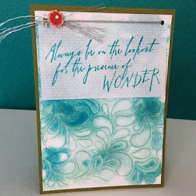
Using the retro sketch gave me great inspiration for the card I want to share.
 I thought this sketch gave a really fun and simple way to add a sentiment to a card.  I used a thin vellum type paper so it didn't overwhelm my background.  I stamped my sentiment from Tim Holtz in a Distress Ink and while that was still wet, I added clear embossing powder which usually adds a little bit of intensity.  
 I loved how my background turned out.  I used a piece of watercolor paper and ran it through my Cuttlebug with a cover die from Lil' Inker Designs.  I didn't take out the cut pieces because I fell in love with the look of it cut but still all together.  Now I spritzed it with water and added random Distress Stain.  I loved the irregular way to paper took the ink.  
Here is the retro sketch.
Thanks for visiting, Linda (lbpost)

Saturday, April 16, 2016

Hello Sunshine

I found a few minutes to play with some online challenges so I first of all went with the color combination of the Color Throwdown blog.
I went with my most favorite way to create a background with Distress Stains.  I added the inks directly to an acrylic block, one color at a time, gave the ink a spritz of water and smooched it onto my watercolor paper, sliding the acrylic block down the paper.  This makes what I call a "messy" background.  I used the Freshly Made sketch to create the layout of my card.  The sentiment is from Wplus9 Designs.
I used a flower from a collection by Tim Holtz, coloring them with Distress Stains and a little accent with a Distress Crayon.  I love the way the Distress products work together so well.  

Here is the Freshly Made sketch.
Thanks for visiting, Linda (lbpost)

Wednesday, April 13, 2016

Love Washi Tape

I like whenever I can go to my washi tape drawer and use some of my stash on a card.  It seemed like the perfect choice to go along with the CAS(e) this Sketch for this week.
 The sketch has three lines near the top of the card so I added three different strips of tape.  Just like that, easy and fast.  
 I love inlaid die cut words so I used this great sentiment from Simon Says Stamp.  I cut the words out of the polka dot strip and then added in the same words cut from red cardstock.  Two little wooden pieces finished off my card.  
Here is the CAS(e) this Sketch.

Thanks for visiting, Linda (lbpost)

Thursday, April 7, 2016

CardMaker Blog hop using Ranger Distress Crayons

Talk about exciting, the CardMaker Blog team has been able to play with the new Distress Crayons from Ranger Ink and wow! I still knew it was going to take some playing and experimenting to figure out just what these could do and how I would want to use them so this was my chance.  
 I am such a huge fan of anything related to Distress Inks by Tim Holtz and I knew these crayons would be no exception to the fun and versatility.  The first thing you need to know about these crayons is that they can do many things.  There isn't one correct way to put them to use in your crafting projects.  That's where experimenting comes in for sure.  You have to realize the different things these can do. 
For my first card, I first of all used a Tim Holtz stencil with some white embossing paste to create a background on watercolor paper and left that to dry.  
I took three colors of the crayons and one at a time colored a portion of my embossing paste background.  I then kept adding spritzes of water to my piece.  I wanted the color to sink into all of the highs and lows of my stencil design.  As I added more color and more water, I worked the colors around and together with my fingers.  I wanted this to be rather "sloppy" and uneven.  When I was happy with my mix, I set it aside to dry. 
 I used a Tim Holtz flower stamp to be my finishing touch.  I did color this with matching Distress Stains and water.  This is a big bonus with the Distress Inks, the colors are the same and so they all can work together.  I finished this flower off by adding Glossy Accents to the petals of the flower.  The sentiment is a die from Simon Says Stamp.  
 Once I started working with the crayons I very quickly found a few ways that I liked to use them.  For this card, I used an extremely simple technique. The butterflies were stamped on watercolor paper and embossed with white embossing powder. Those embossed lines now will act as a resist to the other inks I'm adding.  This stamp set includes the sentiment and three different kinds of butterflies plus the little line of hearts.  
 I most often use water with the Distress Inks but for this card I wanted to try just coloring directly onto the butterflies and the paper.  I scribbled a small patch of one crayon on each butterfly and then moved that color around with my finger.  The color is rather thick as it comes off of the crayon and it is so easy to move it and blend it.  For each butterfly I used two colors of crayons, blending the shades.  I love the intensity of the colors and how nicely they added color, making each butterfly highlighted just right.  
From my blog hop on over to Lisa's blog for more Distress Crayon ideas.  
This also fits with the Fusion Challenge.
Thanks for visiting, Linda (lbpost)