Monday, March 31, 2014

Loving black dots

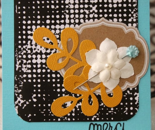
I love playing with stencils and spray ink.  This great piece with the black dots is the result of those two supplies. The stencil is from Tim Holtz and the spray ink is from Clearsnap. The die cut word is from Paper Smooches.
 I used that piece to create a card to fit the Dynamic Duos challenge and the Less is More "round" challenge.  
 Not sure if my green is exactly correct but I like it so I went with it.  I love the look of using a negative of a cut so I took a circle punch and punched out a portion of the black dot piece, making it a little off center.  The butterfly die is from Cheery Lyn Designs.
Here is the Dynamic Duos challenge.
Thanks for visiting, Linda (lbpost)

Friday, March 28, 2014

God Loves You card

I noticed this wheat stamp sitting on my desk and knew it would fit the Less is More challenge to use three of something, perfectly.
 I picked up the stamp and quickly put together this simple little card. This adorable sentiment is from a set by My Favorite Things.
I love the look of embossing an image in white and then adding inks behind it.  I used a couple colors of some Distress Stain on a piece of Tim Holtz watercolor paper. Let me tell you, I love this paper. I seems to word different from other watercolor papers and I love playing with it.  I usually spritz it with water first, that allows the inks to run just right.  I finished it off with three dots of Liquid Pearls.
The layout of the card fits the CAS(e) this sketch.
Thanks for visiting, Linda (lbpost)

Wednesday, March 26, 2014

A "sweet" banner

When I saw the CAS(e) this sketch challenge for this week, I knew I had to play along. It is an extremely simple sketch and I knew the possibilities were endless. 
 I almost didn't know where to start because I had so many ideas in my head!  I worked the colors around the Color Throwdown challenge but I didn't get my card posted soon enough to actually link it to that challenge. 
 I had just received a package from Paper Smooches, so I started with a large flourish image and stamped it twice, embossing it with silver.  Next I took my favorite stencil from Tim Holtz and sponged on my blue.  Next I sprayed a blue spray from Heidi Swapp through the same stencil.  That great banner is a stamp from My Favorite Things, I love that each banner is solid black with a great sentiment on it.  The little jewels helped me bring the colors together. 
 Here is the CAS(e) this sketch challenge.
Here is the Color Throwdown combo I used.
Thanks for visiting, Linda (lbpost)

Tuesday, March 25, 2014

More stencils and sprays!

I think one of the things that keep me going back to playing around with stencils and inks and sprays is that there seems to be no end to the cool results. 
 I started out with a simple chevron stencil and a few green and yellow lines and kept adding.  I wanted to make my card fit the Avery Elle Ombre/Gradient challenge so I kept adding yellow and green sprays and inks, making a concentration of yellow at the bottom edge.  
 I so love this label with it's set of sentiments so I made sure to have that be a part of my card.  The flower and leaves were stamped and cut with the matching dies.  The gold dots are done with Heidi Swapp gold spray, that that stuff!
Here is the Avery Elle Ombre/Gradient challenge. I will also add this to the Avery Elle guest designer challenge since I am sooooo in love with their stamps and dies!
Thanks for visiting, Linda (lbpost)

Sunday, March 23, 2014

Happy Wishes day

Happy Wishes can be for all kinds of occasions so this is a pretty all purpose card.  
 Lawn Fawn has such cute stamps and this border stamp is so one of my favs.  It comes in a set with some other pretty cool border stamps.  PLUS, I love this set with the cool lanterns. I pulled these out so I could create a card for the Lawnscaping challenge of Clean and Simple. 
 After I stamped the border, I quickly colored it with three colors.  Some of the blocks I then coated with a glitter glue, some with Glossy Accents.  I did this just to "bling" up the border a little.  The one lantern was simply colored with Copic markers and accented with some enamel dots, one of my '"go to" accents these days.  I gave the card a final spritz of yellow spray ink by Clearsnap.
Thanks for visiting, Linda (lbpost)

Friday, March 21, 2014

Did I say I love stencils!

Yep, I just keep playing with these wonderful inventions.
 I created this card to go along with the retro sketch.  I started out with a Clearsnap stencil.  I placed it on white cardstock and sprayed it with red spray ink.  Whenever you do this, the stencil is pretty full of ink so I never want to waste that.  I picked it up and put it down on another piece of white cardstock.  I am in love with the way this worked.  
 I used a sentiment stamp from Avery Elle, a banner die from Paper Smooches and a doily die from My Favorite Things.  To add a little more interest I coated the sentiment with Glossy Accents after I colored it with matching Distress Stain. 
Here is the retro sketch.
Thanks for visiting, Linda (lbpost)

Thursday, March 20, 2014

Playing with sprays and stencils

I love to just sit and play around with my supplies to see what I end up with. 
 For this card, I just started using inks, sprays, spritzes of water and stencils to see what I would end up with.  This is several layers and I so love the result
 When this was dry, I took a stencil and ran the whole piece through the Cuttlebug to emboss the stencil design.  It is a subtle design that just adds to the whole look.  The daffodils are a stamp from Printworks as is the sentiment.  The doily is a die from My Favorite Things. 
 The card fits the Fusion challenge
And the Paper Players challenge.
Thanks for visiting, Linda (lbpost)

Tuesday, March 18, 2014

Love embossing paste and stencils!

Yes, I have found a new love in creating! 
 I started my card out by making a "mess" with some black Distress Stain and water.  I knew that this would mostly turn out gray so it would fit with the CAS-ual Friday challenge to use Shades of Gray.  I used Tim Holtz watercolor paper. This is a great weight for playing with.  I made sure to get it pretty wet with spritzes of water and that allowed the ink to run.  
 I had a little bit of black ink leftover in this stencil from Tim Holtz so when I used the white embossing paste, it turned out a little bit gray.  I finished it off with this really neat butterfly die and a stamped sentiment from Wplus9 Designs stamped on vellum.
Here is the CAS-ual Fridays challenge and this card also fits the Less is More challenge to use stencils.
Thanks for visiting, Linda (lbpost)

Sunday, March 16, 2014

Fun Color Combinations

It is so fun to give an online challenge a try. For this card I used the Color Thowndown combo.  
 This was a combination that was such a fun challenge.  I don't use gray often so I had to scramble for products that were gray.  
 I used an acrylic block and inked it with orange, stamping it directly to a piece of Tim Holtz's watercolor paper.  I then inked it again with gray and stamped that too.  The leaf sprig is a stamp from Paper Source, the cut doily is a die from My Favorite Things, the flower dies are from Memory Box and the sentiment is from My Favorite Things.  
 Here is the Color Throwdown combo. 
 For this card I used the Colour Q combo.  Another combination that was pretty cool to use and part of what it even more fun was that text print was part of the combo.  
 The ray stamp is from Neat and Tangled.  I inked it with Distress Stains that were spritzed with water and then stamped.  I glued a page from an old dictionary to white cardstock and then cut out the Paper Smooches die word.  The leaf stamp and die are from Lawn Fawn.  
Here is the Colour Q combo.
Thanks for visiting, Linda (lbpost)

Thursday, March 13, 2014

One Layer

I'm going to say that creating a card in only one layer just might be the toughest challenge for me.  That is the challenge at Less is More for this week.  I just always think I should add something!!!
 I am so loving embossing paste right now.  Guess that says I seem to go with the trends!  I used a stencil from My Favorite Things.  I chose to also use white for the sentiment too that was stamped and then embossed with white.  
I tried to get a close up photo that seems a little bit blurry but you get the idea.  I then sprayed the card with Heidi Swapp gold and dropped some of the ink from a white spray.
Here is the Less is More challenge.
Thanks for visiting, Linda (lbpost)

Sunday, March 9, 2014

Sunny red and yellow

When I saw the color combination for the Color Throwdown, I knew I had to play. 
 This is the result.  What inspired my from the inspiration photo were the striped pillows.  I recreated that look with a Clearsnap stencil and some red Stephanie Barnard spray.  
 When I cut the doily die, I didn't punch out all of the little pieces.  I liked the mix of some punched out and some not.  The leaves are Lawn Fawn stamps and the matching die. I colored the paper first with two colors of Distress Stain.  The button is from American Crafts a the sentiment word is a Paper Smooches stamp that I cut out.  
Here is the Color Throwdown combo.
Thanks for visiting, Linda (lbpost)

Thursday, March 6, 2014

Yellow and Green Triangles

  The Less is More blog has a challenge to use yellow and green and I wanted to play along.
 I used a background stamp from My Favorite Things.  I inked it with two colors of Distress Stain and spritzed that with water.  
 I used a label die and cut out the window.  Under that is a paper stamped with some Wplus9 Designs stamps.  After I stamped the background, I added some drops of yellow and I also cut out a few of the triangles and added them over the bottom ones with foam tape.  Some of the triangles are also coated with Glossy Accents. 
Here is the Less is More challenge.
Thanks for visiting, Linda (lbpost)

Wednesday, March 5, 2014

Flowery Get Well wishes

I am playing along with the CAS(e) this sketch for this week with my card.  
 I love playing around with colors and supplies so the background piece for my card is the result of one of the playing sessions.  This piece had been sitting on my desk for some time and I knew I could make it fit with the sketch very nicely.  The die cut words are from Paper Smooches, I just cut them twice. 
 I started with a small piece of watercolor paper. This was spritzed with water and then I ran three colors of Distress Stain directly to the paper. I spritzed it again with water so the colors would run together.  When this was dry, I stamped the flower in black and embossed it with clear embossing powder.  
Here is the CAS(e) this sketch.
Thanks for visiting, Linda (lbpost)

Sunday, March 2, 2014

Love black and turquoise!

I love using color challenges.  They really do take me "out of my box".  
 For this card, I used the Colour Q combo.  This might have ended up being one of my favorite cards and here, I would not have ever normally used turquoise as a card base and a black pattern with it.  
 The black design was created with a Tim Holtz stencil.  I sprayed it with a Clearsnap black ink and then picked up the stencil and placed it on my paper. The leaves are a Paper Smooches die cut, that label piece is from Maya Road.  
Here is the Colour Q combo.
Thanks for visiting, Linda (lbpost)