Tuesday, March 31, 2009

Girly-Girl - All Boy!!!

My projects for today hit both ends of the spectrum - all girl or all boy!!!

This card uses some adorable stamps by Art Declassified! This photo looking stamp of the ballerina is just so Girly-Girl! I combined her with this wonderful, lace looking paper by KI Memories and a big, pink Tulle bow.

I stamped the image with a black stamp pad. She could be finished with just that but I added a little bit of color and bling. I watercolored the girl with watercolor crayons and a watercolor brush and added some Glitter 3-D Fashion Paint by Tulip to parts of the image. I love this glitter because I can put it exactly where I want it and it always adds some bling while letting the underneath color still show through.


Then on to the All Boy part, this adorable photos of our grandson who is now 6 years old. These are some of my all time favorite photos of him because he loves to be outdoors and he just looks ALL BOY!

The little journaling piece was printed from the computer and then I used a journal punch to make it look like torn notebook paper.

Thanks for visiting, Linda (lbpost)

BABY TAKE A BOW card
Materials:
Cardstock – Bazzill swiss dots
Patterned papers – We R Memory Keepers and Bloom, Frosty Lace/KI Memories
Stamps – Aliases/Alice/Art Declassified
Ancient Page - Clearsnap
Watercolor markers and watercolor brush
Tulle and ribbon
Machine sewing
Rhinestones – Mark Richards, Inc
Corner rounder punch – Round It All/Bind It All
Glitter Fashion 3-D paint – Tulip


ONE CUTE KID

Materials: Cardstock
Patterned paper – Quick Quotes
Powder Puff stamp pads – Quick Quotes
Orange puffy letters – American Crafts
Tiny letter stickers – Sticko
Aleene’s® Paper Glaze – Tulip
Chipboard dinosaur – BasicGrey
Brads – Karen Foster
Border punch – Stampin’ Up
Font – CK True Type

Sunday, March 29, 2009

CPS #109 - Simplify and New Baby

I guess just because I was feeling creative, I created two cards with this weeks Card Positioning Systems blog sketch. I think it was because a few ideas came to my mind when I got started creating my card so I just figured, why not work out a couple of them and you can see that I used two different sizes of card bases for this same sketch.
Can you see that peek of the inside of the card. I took the photo from the side so that you could see that this wonderful paper from CutCardStock.com is two different colors. How fun would that be to receive a card that is yellow on the front and orange when you open it. That is just one of the great color combos of these Sorbet papers.
I think I picked the word "simplify" for my greeting because of how simple I tried to keep my finished look with this wonderful patterned paper and that leaf punch that matches. The sticker letters were white when I started and I just brushed them lightly with a yellow and a blue Fluid Chalk stamp pad. Now they match even better.
I have to laugh when I look at this card because it represents one of my most recent paper purchases, like I NEED anymore patterned paper! I just thought this piece with these adorable animals was so cute. The orange paper for the card base is metallic and it is also from CutCardStock.com. The orange is just so bright and "happy" looking for a baby card.
I cut out one of the animals and there are many more on the one piece of paper. The patterned paper with the little squares on it are the backside of this paper.
Thanks for visiting, Linda (lbpost)

SKETCH 109 – SIMPLIFY card
Materials:
Cardstock - CutCardStock.com
Patterned paper – Urban Prairie/Basic Grey
Branch punch – Emagination
Sticker letters – American Crafts
Fluid chalk stamp pads – Clearsnap
Border punch – Martha Stewart
Machine sewing
Scallop circle and circle punches – Marvy

SKETCH 109 – NEW BABY-itty bitty card
Materials:
Cardstock – Stardream Metallic Fuse/CutCardStock.com
Patterned paper – Best Creations Inc. (both sides)
Circle scallop punch and circle punch – Marvy
Rub-on words – 7 gypsies
Brads – Creative Impressions
Ribbon
Fluid chalk stamp pad – Clearsnap

Friday, March 27, 2009

Want some YUM colors!?

I set out to meet a couple fun challenges this week and ended up with some pretty neat color combos.
This card was designed after Laura's Sketch #22 at 2 Sketches 4 you blog. I have this big package of amazing SEI prints so I wanted to pull out some more of those for cardmaking. These two prints are both sides of this one piece of paper.
I used some adorable stamps from a set by TJ Designs. These are great rubber stamps with a cling backing. Can you see that I stamped over the dot patterned paper? I used a line of music notes and stamped that in a color that matched the paper so the stamped images would be subtle.

You guessed it, my next card uses KW Werner Designs, Color Inspiration challenge #47. I always just melt when I see the colors she puts together for her challenges.
Can you also guess what I used for the foundation piece of my card? Right, a paint chip from the home improvement store. This particular kind of paint chip is cool because it comes with these little punched out squares. I just let those be a focal point and backed them with white cardstock.
The flowers I had that I wanted to place in those punched out squares were white so I sprayed them with Memories Mists sprays by Stewart Superior. It only took a quick squirt or two and they were a wonderful shade of orange. The stamps are by Art Declassified. I LOVE that fun and artsy circle design.
Thanks for visiting, Linda (lbpost)
EACH DAY… card
Materials:
Cardstock – Bazzill swiss dots
Patterned papers – Adirondack/Poppy/SEI
Stamps – Bird nest, greeting, notes and circle design – Song Birds set/TJ Designs
Ancient Page and Fluid Chalk stamp pads - Clearsnap
Pearl brad – Recollections
Corner rounder punch – Fiskars
Scallop border punch – EK Success
Scallop circle and circle punches – PaperShapers/EK Success
ALL MY LOVE card
Materials:
Cardstock – Prism
Paint chip from the home repair store
Stamps – Bisous/Kewel Frame/Art Declassified
Ancient Page - Clearsnap
Flowers – Petaloo
Memories Mists spray color – Stewart Superior
Rub-on words and phrases – Art Warehouse
Corner rounder punch - Fiskars
Ribbon

Wednesday, March 25, 2009

CPS sketch #108 and TAC products

You guessed it, at Card Positioning Systems blog, we had another great sponsor this week. Chris Franco with TAC or The Angel Company.
I instantly fell in love with the package of papers that were in my kit and so I just HAD to make two cards!!!
My kit contained this adorable flower stamp. The same set also has the cutest little ladybug stamps. I stamped an additional flower and cut that out. I added it to the card front with foam tape and I stamped an additional middle of the flower and cut that out adding it with foam tape too and coating it with the Aleene’s® Paper Glaze by Tulip. That gave the middle of the flower a great, epoxy look. All of the layers added some neat dimension.
Like I said, I just had to use more of the papers so I cut out one of the flowers and punched out some of the circle designs.

I then used a bunch of Stickles to accent the designs. Of course, that added a wonderful amount of BLING!
Thanks for visiting, Linda (lbpost)

SKETCH 108 – FORGET ME NOT card
Materials:
Stamps, Card stock, Papers: The Angel Company (courtesy of Chris Franco, Independent Demo)
Stamp pads – Ancient Page and Fluid Chalk/Clearsnap
Clear Paper Glaze – Aleene’s®/Tulip
Scallop border punch – EK Success


THANKS FRIEND card
Materials:
Stamps, Card stock, Papers: The Angel Company (courtesy of Chris Franco, Independent Demo)
Scallop border punch – EK Success
Ancient Page and Fluid Chalk stamp pads – ClearsnapStickles/Ranger

Tuesday, March 24, 2009

Creating accents

First of all, I needed to share a photo from yesterday. Dathan, our youngest grandson, is just discovering our backyard. What do you think he had to start collecting first? STICKS!!! Every stick he could find! Yes, that does look close to his eye, but it wasn't and we were watching him every minute!
Are there cuter photos to capture then a newborn sleeping with his little bottom sticking up? He just looks so cuddly. This is our youngest grandson who will be turning one year old this month.
I am always so impressed with clean and simple looks and I always think that I just can't achieve them, so I really tried here with a couple simple patterned papers and a white background.

The circle accent is created with JustRite stamps. These are neat because you totally personalize it with tiny letters that you add. When I set up this particular stamp, I used it to create an announcement too since I could add in his birthdate.

I wanted to point out the "paper" that I created to go with this layout. I like how personal you can make an accent with the computer.

I typed in the alphabet and added in words that went along with a new baby. So when I came to the "T" in the first set of letters, I typed in "TINY".

I made the block background black and changed the letters to white which is really just a clear color and so the letters turn out to be the color of the paper you print this on.

Thanks for visiting, Linda (lbpost)


(NEW)baby layout
Materials:
Solid Cardstock
Patterned paper – Secret Garden/Life Is Beautiful/Sassafras Lass and Times Nouveau Collection/Graphic 45
Alphabet/word piece – computer generated – Times New Yorker font
Corner rounder punch – Papershapers/EK Success
Priceless stamp – Crafty Secrets
Thickers – American Crafts
Name/Monogram stamp – JustRite stamps
Stamp pads – Clearsnap

Sunday, March 22, 2009

"Heart" stuff

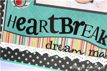
It just so happened that both of these projects have the word "heart" in the title or greeting! The one thing that is pretty true is that this little guy is a heartbreaker with those big brown eyes and that cute smile!
This is our youngest grandson and you can see that I was able to capture those first two little teeth in the photo.
Two interesting things to point out on this layout is the mix of sticker letters that I used for the main title. I just love to mix fonts and sizes of letters. I wanted a little extra accent but didn't really want flowers on a boy layout so I created my circle accents with buttons in the middle. This let me bring in a little more color and use more of the striped paper accent.
I have always loved these Color Inspiration challenges but I don't usually get time to play. I did work out this combo for Challenge #46 although it is too late to post it along with that challenge on her blog. Oh well, love the card that resulted.
It was hard to actually find a patterned paper that held all of the colors, so I just pulled out papers and prints that were on my table that fit.
I used some epoxy flowers that I have had for awhile. I took this photo from the side view so you could see that I layers two flowers together and you can barely see it, but I added a black pearl.

Thanks for visiting, Linda (lbpost)

HEARTBREAKER – DREAM MAKER layout
Materials: Cardstock
Patterned paper – Hometown:Country Library and Weathervane:Picking Pumpkins/October Afternoon and Dreamy 2:Blue Without You/My Mind’s Eye
A big mixture of sticker letters for the title
Tiny sticker letters - Sticko
Circle punch – McGill
Buttons
Martha Stewart border punch
Tonic Paper Distresser


HEARTFELT THANKS card
Materials:
Cardstock
Patterned papers – Basic Grey and Scenic Route
Border punch- Martha Stewart
Epoxy flowers – Making Memories
Ribbon – May Arts
Self Adhesive Black pearl – Mark Richards, Inc.
Machine Sewing
Rub-on greeting – Deja Views

Friday, March 20, 2009

Couple cards to share

I was visiting one of my LSS's the other day and they had these new destination stickers by Mrs. Grossman's. I could just see how cool they would be on a card and I picked the "Paris" one since I so want to go there someday.

I used one of my new border punched from Martha Stewart for part of my accent. (TIP)That was rubbed with a stamp pad, that helps bring out the embossing and the details after the punching. The patterned papers were brand new prints I found from Graphic 45.
The entire "Paris" piece and the little stamp looking stickers are from the set of destination stickers.
This card was created with some of my favorite supplies, October Afternoon prints and Thickers "Naked" letters. I love the shaped papers that are being sold lately and a fun use for them is to just use a portion on a card.
I added the Diamond Glitter 3-D Fashion paint to the thin turquoise border on the paper. I love this glitter paint because it adds glitter but still lets you see the color underneath. It is hard to tell from the photo, but I coated each of the tiny black letters with the Aleene's Paper Glaze by Tulip. That gave them a great epoxy look that adds alot of charm to the card.
Thanks for visiting, Linda (lbpost)

YOU HAVE A FRIEND IN ME card
Materials:
Patterned paper – Hilary Artisan Edge Blue/Noteworthy/Making Memories and Blue Ribbon Quilt/October Afternoon, Flower cut from Ferris Wheel/October Afternoon
Letters for friend - Chipboard Hat Box Thickers/Remarks/American Crafts
Mini black sticker letters – Sticko/EK Success
Diamond Glitter 3-D Fashion paint – Tulip
Aleene's Paper Glaze - Tulip
Orange rhinestone – Me & My Big Ideas
Zig Zag scissors – Fiskars
Creamy Brown Fluid Chalk stamp pad – Clearsnap
Tonic Paper Distresser
Rolodex hole punch

PARIS - JOURNEY card
Materials:
Cardstock
Patterned paper – Postage/Communuique Collection and Tre Chic/Fashionista Collection/Graphic 45
Destination sticker – Mrs. Grossman’s
Rub-on words – Making Memories
Powder Puff chalk stamp pad – Quick Quotes
Border punch – Martha Stewart
Rhinestones – Mark Richards, Inc.

Tuesday, March 17, 2009

CPS and Our Daily Bread Designs, even 2 Sketches 4 You

The sponsor for this week at Card Positioning Systems blog is Our Daily Bread Designs stamps. I picked a set of scripture verses to work with. I was so excited to get to work with these stamps because adding a scripture verse is such a great way to send a friend a card for so many different reasons and they also are a great way to create a gift set of cards to give to a friend.
This first card uses the sketch for CPS for this week. The way that Tami drew it, it was long and skinny, I just turned it up on it's side for my card. One reason I just love a sketch as a launching pad is that you are supposed to just take a piece of inspiration from it and make it your own.
I have worked with a lot of stamps over the years and I was very quickly very pleased with these particular stamps. They are rubber and cling so you do use them with an acrylic block. I just love how clear the words stamp. Everytime the image was just perfect. I also used CutCardStock.com's Cryogen White paper to stamp on. It is truly amazing how well this paper stamps on. I purchased an entire package just for stamping on.
I wanted to use a few of these great scripture stamps so you could see how wonderful they look on a card front.
For all three of my cards, I used the same package of patterned papers by SEI! You can see the metallic accents in the prints and for this card, I added red rhinestones to some of the flower centers.
This last card uses the 2 Sketches 4 You card for this week, Kazan's Sketch #22.
I took this photo from the side so you could see the dimension. I cut a couple of the flowers and leaves from the patterned paper and added some rhinestones. The scallop border is a new punch by EK Success.

Thanks for visiting, Linda (lbpost)

SKETCH 107 – EVERYTHING BEAUTIFUL card
Materials:
Bible verse rubber stamps – Scripture Collection 1/Courtesy of Our Daily Bread Designs
Cardstock – Stardream and Cryogen White/CutCardStock.com
Patterned paper – String Bikini/Poppy collection/SEI (both sides)
Versafine black stamp pad
Self Adhesive pearls – Mark Richards, Inc.


LORD’S GREAT LOVE card
Materials:
Cardstock
Patterned papers – Parasol/Poppy Collection/SEI
Scripture Collection #1 Stamps – Courtesy of Our Daily Bread Designs
Versafine black stamp pad
Corner rounder punch – Fiskars
Scallop punch- Martha Stewart
Ribbon
Rhinestones – Mark Richards, Inc.

EVERYTHING BEAUTIFUL card
Materials:
Cardstock
Patterned papers – Espadrille and Rattan/Poppy Collection/SEI
Scripture Collection #1 Stamps – Courtesy of Our Daily Bread Designs
Versafine black stamp pad
Ribbon - Michaels
Scallop border punch – EK Success
Rhinestones – Mark Richards, Inc.

Sunday, March 15, 2009

Think GREEN!!! It's MARCH

I think it is pretty funny that when I hear "MARCH", I think of the color "GREEN"! Just seems to go with March 17th being St. Patrick's Day. Thought I would share a couple cards along that theme. This first card uses Laura's sketch #21 at 2 Sketches 4 You's blog since I just love to use a sketch as my inspiration on how I am going to arrange my card. Some recent stamps I received are a couple sets by Kim Hughes and Cornish Heritage Farms and I loved finding this great, simple shamrock on this set.
I wanted to be able to show you how I finished the shamrock image. Like I said it is a very simple outline of a shamrock and so it can be finished in a number of ways. I stamped it on a piece of patterned paper and embossed it with black embossing powder so the edges were raised. Then I did a very light coloring with Copic Markers. Next I filled the image in completely with Aleene's Paper Glaze by Tulip. I love how easy it is to fill in an image with the Paper Glaze and it dries with a 3-D, epoxy look. The patterned papers are a collection by Making Memories.
For the above card, the colors and the stamps are what set the theme. I used a "ticket" stamp for the beginning of my designs.
One feature I want to point out is that after I stamped the solid shamrock stamp with green ink, I coated each one with Aleene's Paper Glaze by Tulip. This gave each of the shamrocks an epoxy look.
I wanted to take a minute to show you the steps that were taken to create my tickets with a St. Patrick's day theme.
1. The bottom part of the above example shows the ticket stamp as it is stamped, a line of three tickets.
2. The second image show the very simple stamps that I added to the open areas on the tickets. The stamps that were used for that are from the $1 bin.
3. This last photo, shows the finished strip of tickets that are stamped and cut out. I inked the cut edges with Chalk stamp pads. So the finished card is five sets of these stamped tickets. I just alternated how I stamped the images.

Look what is growing out in my backyard.

While some of you are still dealing with snow, we have Calla Lillies growing.

Thanks for visiting, Linda (lbpost)

St. PATRICK’S DAY card

Materials: Solid cardstock - Prism

Patterned paper – Good Luck/GreenDay/Reminisce

Rubber stamp – Three Blank Tickets/InvokeArts and St. Pats set/Studio g

Fluid Chalk stamp pad and Ancient Page stamp pad – Clearsnap

Clear Paper Glaze – Aleene’s®/Tulip

Mini black brads – Karen Foster

Hand Held circle punch - McGill

Scor-Pal tool

LUCKY card
Materials:
Cardstock and ribbon – Paper Trey, Ink
Patterned papers – Greenhouse/Making Memories
Stamps – Shamrock and word – Sweet Spring/Kim Hughes collection/Cornish Heritage Farms
Versafine black stamp pad
Clear embossing powder
Copic markers
Clearsnap Fluid chalk stamp pads
Ribbon and machine sewing
Tonic Paper Distresser
Clear Paper Glaze – Aleene’s®
Rhinestones – Darice
Circle punches – McGill
Scallop circle punch – PaperShapers/EK Success

Friday, March 13, 2009

Gotta make cards from challenges!!!

Do you understand???? I LOVE challenges and so I picked a couple to work with this week. The first one is sketch #5 on Card Patterns, a card sketch site.
I was in Michaels and came across this little tag book of a mix of paper patterns from ColorBok and since I love this color of green with black, I knew I had to have it plus it was in the $1 bin!!! I combined some of the prints with some Cornish Heritage Farms stamps by my friend, Kim Hughes.

I did emboss the shoe with black ink and powder so that the finished image was more intense. And that little border design is pleated paper. Kind of a fun and different accent.


This next card is using the color inspiration for this week. There aren't very many colors to this scheme for this week but oh was it fun to work with. I picked some metallic Stardream paper by Cut CardStock.com in a gunmetal color.

The butterflies are also by Kim Hughes and Cornish Heritage Farms. I embossed them with the black so they are real intense in color. The gunmetal metallic paper was dry embossed with a Cuttlebug embossing plate.
Thanks for visiting, Linda (lbpost)


BLACK AND WHITE SHOE/HELLO card
Materials:
Cardstock – Cut CardStock.com
Patterned papers - ColorBok
Stamps – Shoe and Hello stamps – Little Gal/Kim Hughes collection/Cornish Heritage Farms
Versafine black stamp pad
Clear embossing powder
Clearsnap Fluid chalk stamp pads
Ribbon and machine sewing
Circle and Scallop circle punch – PaperShapers/EK Success
Tiny flower punch – PaperShapers/EK Success
Glitter brads – Making Memories

PRECIOUS/BLACK BUTTERFLIES card
Materials:
Cardstock – Cryogen White, Stardream and Eaames Graphite/Cut CardStock.com
Stamps – Little Solid Butterfly/Sweet Spring/Kim Hughes collection/Cornish Heritage Farms
Cuttlebug embossing plate – Provo Craft
Versafine black stamp pad
Clear embossing powder
Lacey border punch – Martha Stewart
Swirl Rhinestones – Prima
Black self adhesive pearls – Mark Richards, Inc.
Rub-on word – Making Memories
Ribbon - Michaels

Monday, March 9, 2009

CPS #106 and a Thank You card

Every new sketch at Card Positioning Systems blog is my new most favorite!!! So, of course, this week's is my favorite!!!
I love the swirl lines on the side. I love that when you look at a sketch you need to interpret this as you see it and I had fun hand cutting my little swirl or wave pieces of paper.
This view shows off the dimension of my flower. The flower layers are two sizes of punches. The clear button was glued to paper with the Aleene's Paper Glaze. I used the Paper Glaze because I knew it would dry clear and wouldn't show through the clear button. The dragonfly and the little greeting are both new stamps by my friend Kim Hughes from the Little Gal set for Cornish Heritage Farms.
I so love these papers by BasicGrey so I created this card with them. The flowers are cut out of one print. The rub-on greeting and the ribbon are both BasicGrey.
Thanks for visiting, Linda (lbpost)
SKETCH 106 – SUGAR & SPICE card
Materials:
Cardstock – CutCardStock.com
Patterned paper – We R Memory Keepers
Flower punches – Papershapers
Clear button
Clear Paper Glaze – Aleene’s®/Tulip (to glue the clear button to the patterned paper)
Stamps – Little Gal/Kim Hughes/Cornish Heritage Farms
Versafine Black stamp pad
Memento Stamp pad
Tonic paper distresser
YELLOW THANK YOU card
Materials: Solid Cardstock
Patterned papers – BasicGrey (flowers cut from one print)
Ribbon – BasicGreyWholy Cow rub-ons - BasicGrey
Self Adhesive pearls – Mark Richards, Inc.
Hole punch – McGill
Corner rounder punch – Papershapers/EK Success
Fluid Chalk stamp pad – Clearsnap
Machine sewing

Saturday, March 7, 2009

Opening day of baseball season

So, it totally looked like spring here today, gorgeous weather and it is opening day of baseball season for two of our grandsons.
I wanted to share a layout I did with photos from last year. I used my "collage" feature in Picasa 3 to group the photos and so they are then printed out as one big photo. LOVE that feature!!!If you look closely at this close-up of the layout, I coated the chipboard arrow pieces with the Aleene’s® Paper Glaze by Tulip so they had an epoxy look. It looks wet but it is dry, I just love these kinds of accents.

Thanks for visiting, Linda (lbpost)


ATHLETICS TEAM layout

Materials: Cardstock
Patterned paper – Pop and Snappy/Get Happy/Twist & Shout collection/Cosmo Cricket
Cream Soda Thickers Sticker letters – Remarks/American Crafts
Tiny letter stickers – Sticko
Aleene’s® Paper Glaze – Tulip
Chipboard arrows – Maya Road
Rub-on words and glitter sticker letters – Making Memories
Picasa 3 collage program

Thursday, March 5, 2009

VOTE! Please, Please, Please!

How did I get into another voting contest!? Who knows! I just love to create and I love a challenge!
Go to CARDS new blog and vote in their cover contest.
My card might have something to do with "SUN" and "RAYS" and "DOTS"! It is called Summer Fun.

THEN....go visit my youngest daughters amazing photography blog. She took pics of her long time childhood friend and wowie!!! This girl is gorgeous but these photos just shine!
Amanda Rae Blog

Thanks again for visiting, Linda (lbpost)

Wednesday, March 4, 2009

Color Inspiration Challenge and 2 Sketches 4 You cards

I have watched other designers create amazing cards with the color inspiration at Kwernerdesign.com and I finally found a few minutes to participate! LOVE the color combos she comes up with. I'm late for challenge #43. She already has another color combo up for this week, but I still wanted to share my card.


Another techinque I have wanted to try for sometime is to use a grouping of butterfly punches and that just seemed to fit when I studied the color inspiration colors.

Can you just say that this sea of colorful butterflies makes you HAPPY?

Next is my take on 2 Sketches 4 You's, Kazan's sketch #21 for this week.

I recently picked up this too funny rubber stamp at Michael's and this seemed like the time to use it.

Notice my lattice design on the white cardstock? I wanted to use my Scor-Pal tool to go with this sketch since they are featuring a scoring tool on that blog this week. The score lines on the tool make this a snap to create and I rubbed it with a Fluid Chalk stamp pad and that highlighted the score lines.

Thanks for visiting, Linda (lbpost)