
I love working with color challenges but let me tell you, this one by The Play Date Cafe is over-the-top. Not sure what I like most about this, the photo or that splash of red.


I like this stamp because of the collage way the elements are put together on it, but also because when you stamp it with black ink, there are a number of ways that you can add color. Here I masked off part of the design so that I could spray the one side with red ink. I colored the flower with Copic markers and added a coat of Aleene's Paper Glaze, so the flower stands out a little bit.

A long time ago, I used this stamp in another way and I thought I would show you that one as well. The background for this one was colored by running a brayer across a multi-colored stamp pad. This works best with glossy cardstock but matte will work too. This is a fun way to create a background.
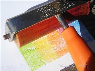
Here is a little glimpse of what I mean by that. The brayer is ran across the paper until a solid coat of color is applied then the image was stamped over that with black ink.
Thanks for visiting, Linda (lbpost)
ABC - SISTERS card
Materials list:
Cardstock – Core Impressions/Core’dinations
ABC – Sisters stamp - Paper Bag Studios
Black Versafine stamp pad
Clear embossing powder - Stampendous
Copic markers
ChalkBoard spray – Tattered Angels
Red Spray color – Memories Mist/Stewart Superior
Clear Paper Glaze – Aleene’s®
Self adhesive pearls- Queen & Co.
Border punch – EK Success
Sandpaper
Wonderful choice of PBS images to use for this weeks challenge. The embossing and punched edge really add to the beauty of your card. Thanks for playing at the PDCC.
ReplyDeleteI can see why you like the photo. It's fantastic! Your card is just gorgeous!
ReplyDeleteWhat a wonderful card--just love all your details! I love that flower and that focal image--so FAB! Great job!!! So glad you joined in the fun this week--THANKS so much for playing along with us at the PDCC:}
ReplyDeletewhat a fun card!
ReplyDeleteFab use of the PBS images. Lovely cards! Glad you decided to play along with us at the PDCC.
ReplyDeleteLove the stamps set and the vintage look is always a favorite of mine.
ReplyDeleteFab, fab, fab, fab, fab! Love this card, especially the way you took elements of the photo as inspiration as well as the colours. The blue flower looks great with the splash of red behind :)
ReplyDeleteGREAT cards and I havent done the brayer thing in so long- gotta get it out!
ReplyDeleteLOVE the color combination! That pop of red is fantabulous!! That image is AWESOME!
ReplyDeleteThis was among the first stamps we released and I still love it! Beautiful card!! Thanks!
ReplyDeleteI love this!! Your attention to detail is so wonderful - the textures and patterns are definitely evocative of the inspiration photo, and I love that you've combined the vintage image with this bright palette!
ReplyDeleteLovely card! And I liked how you did the coloring in the second photo. I need to get myself a brayer.
ReplyDeleteCool color combo and great card Linda!
ReplyDeleteLuv that splash of red! Perfection!
ReplyDeleteSuper cool card!
ReplyDelete