Showing posts with label Backgrounds. Show all posts

Thursday, October 15, 2009

Photo goodness and Stamping goodness

BoldMy first goodness to share with you requires a stop at my daughter's blog to take a look at the adorable photos she took on a Pumpkin Patch trip with some of my grandkids. The focus was to be my youngest grandson, but you can see some glimpses of some of my other grandkids too. I took this one photo from her blog to share this cute little scene with four of our grandkids. Now for the Stamping goodness. This card is shown in the gallery at Pink Persimmon but I wanted to show you the details. All of the stamps are from Pink Persimmon. Are they cute or what? I love the look of a new set of alphabet stamps and I love the font on this super cute set. So I arranged these letters on an acrylic block and repeatedly stamped the alphabet to create a background on the notebook looking paper by Scenic Route. I punched the one side with the Stampin' Up journal punch so it looks like I tore my paper out of a notebook. The little girl from the Little Red Wagon set was stamped on white paper and again on this adorable red, plaid paper by October Afternoon. Then I just cut out the dress portion and glued that on top of the image stamped on the white paper. The other portions of the stamp were colored with Copic Markers. I attached the little girl and the wagon with foam tape because I just love the dimension this gives a card. The wagon is also coated with Aleene's Paper Glaze. I so love the epoxy look that gives and it makes it look like a new, shiny, red wagon. (ps, another great thing about Aleene's is that it is available at stores like Michaels so it is so easy to get ahold of)

Thanks for visiting, Linda (lbpost)

ABC’S card

Materials:

Cardstock – Curious Iridescent Cryogen White/CutCardStock.com and Vintage collection/Core’dinations

Patterned paper – October Afternoon and Scenic Route

Stamps – Soda Pop small alphabet and Little Red Wagon/Pink Persimmon

Fluid Chalk stamp pads/Clearsnap

Versafine Black stamp pad

Clear embossing powder

Journal border punch – Stampin’Up

Clear Paper Glaze – Aleene’s®

Copic markers

Mini black brads

Sandpaper

3M Foam tape

Thursday, December 18, 2008

Snowflakes and Candy Canes!

I don't know if I have ever had so much fun coming up with new Christmas cards. There are just so many wonderful supplies available and I want to use them all!
For the card above, I just had to make use of these great stamps by Unity Stamp Co. The distress dot background stamp and the greeting stamp, "Jesus is the reason for the season".
The brackets are part of the greeting stamp. I stamped the greeting with black ink on a piece of plain white cardstock and then stamped it again on an extra piece of paper with red ink and cut out just the brackets. They were added to the greeting on the front of the card with foam tape for added dimension.
Before adding my extra brackets, I masked the greeting that I had stamped on my card front and stamped the distress dot background over that. This stamp was inked with red and green ink. I then sprayed some Key Lime Pie Glimmer Mist over this piece.
The snowflakes are punches. I punched them out of white cardstock. They were then sprayed with Glimmer Mist spray to add the red color and I brushed them with Twinkle Glitter to add some sparkle.

Thanks for visiting, Linda (lbpost)
JESUS IS THE REASON card
Materials list:
Cardstock – Core’dinations
Dot background and “JESUS” verse stamps – Unity
Memento Stamp pads
Key Lime Pie Glimmer Mist – Tattered Angels
We R Memory Keepers patterned paper
Gllitter 3-D Fashion paint – Tulip
Snowflake punch – Martha Stewart and Papershapers
Machine sewing
Gold ribbon – Michaels
White paint

Monday, December 15, 2008

Glimmer Mist - 2 ways

I wanted to highlight a couple more of the projects I created for my Guest Artist time with Tattered Angels this month.
Once you start playing with Glimmer Mist you quickly find there are a number of pretty stunning things you can do with them. The Glimmer Screens are a great compliment. Glimmer Screens are really "masks", they are a lightweight plastic design/shape.
One way to use these two products together is to place the screen on your paper, then spray the Glimmer Mist. The Mist will color the paper on the areas of the paper around where the screen was. BUT - here is the good part - there is now mist all over that plastic screen. Don't waste it, blot it off with another piece of paper. My two cards here are examples of how to use the Screen and the Mist with both of these uses.
On the above card, I placed the flourish screen on a piece of plain white cardstock and sprayed the Key Lime Pie mist. While the screen was still on the paper, I took another piece of plain white cardstock and blotted the screen, transfering all of that extra mist onto my paper. Now I can lift off the screen from my first piece of paper. The design left on my first piece of paper will be the negative of the screen design that you see on this first card.
I took a fine tip pen and drew around the inside of the area that was left uncolored by the screen. Then I added a small amount of Fully Purple and Coffee Shop Glimmer Mist to this piece of paper. Once the entire card was put together with the punched border and the green card base, I sprayed the Copper Metallic Glimmer Mist. You don't really see that here, but the whole card front has a GLEEM to it.
Now remember that piece of white cardstock that I used to blot the green mist off of the screen? I cut out that design, a wonderful green flourish.
Once it was completely cut out, I coated the entire green portion of the flourish with Glossy Accents by Ranger and left that to dry. This dries with a glossy, dimensional finish.

Thanks for visiting, Linda (lbpost)
NOW and FOREVER card
Card base - Core'dinations
Plain White cardstock
Glimmer Mist and Glitter Screen - Tattered Angels
Rub-on words - Making Memories
Heart brad
Martha Stewart border punch
MEMORIES card
Card base - Core'dinations
Patterned paper - October Afternoon
Glimmer Mist and Glimmer Screen - Tattered Angels
Rub-on word - Luxe
Machine sewing
Black felt flowers - Prima
Glimmer brads - Doodlebug
Glossy Accents - Ranger

Monday, December 1, 2008

Card Positioning Systems and My Favorite Things stamps

Is this little guy CUTE!!?? My Favorite Things stamps was the sponsor this week for CPS and I picked out a little set of jungle animals, It's A Jungle Out There. These is a clear set of stamps and there are so many images on this one sheet.
1. I stamped my little elephant and embossed him with black embossing powder. I usually like to do that so that now whatever else I do for coloring, etc., he will really stand out.
2. I colored him in with Copic markers. These markers are great for doing some shading.
3. I stamped the little leaf stamp many times all around the border.
4. I colored in some of those leaves with a Copic marker
5. I put a mask over the colored elephant and sprayed the entire piece with Key Lime Pie Glimmer Mist. (To create a mask, simple stamp the image on a piece of lightweight paper like computer paper and cut that out. When you lay that over your original image it will protect it from whatever else you are going to do)
6. The elephant was given a coat of Gloss Accents by Ranger.
7. As I assembled my card, before I added my stamped piece, I sprayed the entire front of the card with a spritz of Sapphire Glimmer Mist. I didn't want to cover the white cardstock and the striped patterned paper, I just wanted a little bit of an accent with the spray.
8. A piece of twine tied around the card gave the finishing touch.

Thanks for visiting, Linda (lbpost)

DON’T FORGET card
Materials:
Cardstock
Stamps courtesy of MY FAVORITE THINGS
Patterned paper - October Afternoon
Glimmer Mist/Key Lime and Sapphire – Tattered Angels
Copic Markers
ColorBox black stamp pad and Top Boss Black embossing powder – Clearsnap
Green stamp pad – Fluid Chalk and Ancient Page
Twine
Brads – Karen Foster
Gloss Accents - Ranger

Monday, November 10, 2008

Creating Backgrounds - PART 10 - Glimmer Mist

I have shared some ideas for creating backgrounds using Glimmer Mist by Tattered Angels before but I just had to pull them out again. I picked up a couple new colors recently and of course, I had to try them out.
What I had mostly wanted to accomplish with this first card was to create a fancy, colored paper to stamp the bird on. I actually did stamp and emboss the bird first and then colored that paper with a couple colors of Glimmer Mist.
One of my new colors was Coffee Shop so I sprayed that and then accented it with a little bit of the Key Lime Pie. I thought that little bit of green helped my piece match my background paper. From the side, the Coffee Shop brown has a copper sparkle. The leaves on the stamped piece were accented with Platinum Stickles. The background piece that this circle sits on was punched on both sides with the Stampin' Up notebook punch and then stamped with the alphabet stamp by CatsLife Press. The punched edges were distressed with the Tonic Paper Distresser and inked/colored with the Powder Puff chalk inks by Quick Quotes. If you haven't seen or heard of these stamp pads before, you need to take a look. Great colors and they are so easy to work with.
For this next card, the flowers are part of a piece of Irresistible patterned paper by Quick Quotes. I cut out the flowers and they were plain white with the black outline lines. I filled in the bottom petal of each of the flowers with the Icicle Stickles. The Icicle Stickles has a chunkier glitter in it.
The help the flower match the purple patterned paper I used for the card, I sprayed the flower with the Fully Purple Glimmer Mist and then I used the new Copper Metallics to spray the entire front of the card. This color is meant to give a nice "Glimmer" to the project rather then a strong color change. Notice how it colored the Stickles. I wish you could see the really cool GLEAM the card has from the Copper.
Thank You for Visiting, Linda (lbpost)
I LIKE YOUR STYLE card
Materials list:
Solid Cardstock
Patterned papers – Bob’s Boxers/Quick Quotes Papers
Bird stamp – Inkadinkado
Alphabet stamp – Catslife Press
Greeting stamp – Printworks
Pearl brad – Gartner
Powder Puff stamp pads – Quick Quotes
Platinum Stickles – Ranger
Hole punch – Stampin’Up
Machine sewing
Ribbon
Coffee Shop and Key Lime Pie Glimmer Mist – Tattered Angels

MISSING YOU card

Materials list:
Solid Cardstock
Patterned papers – Irresistible and Bandana Rama Collection/Quick Quotes Papers
Icicle Stickles – Ranger
Fully Purple and Metallics Copper Glimmer Mist – Tattered Angels
Rhinestone swirls – Prima
Rub-on greeting – Making Memories

Sunday, November 2, 2008

Creating Backgrounds - PART 9 - Photos

I love to take photos of all kinds of things around me and I love to use those photos on my projects. Perhaps my favorite time of the year to take photos of nature is the Fall months.
This is an 8 1/2" x 11" layout and the entire thing is a photo matted on a dark orange piece of cardstock. I did print it out on photo paper. My favorite photo paper for printing photos at home is Ilford's Smooth Pearl.
I wanted that photo of leaves to be able to really shine through so my title is nothing more then chipboard letters cut with a Sizzex font and my Cuttlebug. In case you are wondering, the Cuttlebug does a great job of cutting through chipboard.
I used a poem to be the finishing touch to my layout. I typed it into the computer and spaced the lines of the poem so that after I printed it out on a piece of vellum, I could add strips of patterned paper between the lines.
The vellum is see-through, giving the colored leaves underneath another chance to show through and not be covered up.
I used a Sakura 3-D Glaze pen to doodle around the edges. This just added a little bit of extra interest and the 3-D ink looks so cool.
Thanks for visiting, Linda (lbpost)
AUTUMN’S ARTWORK layout
Materials:
Cardstock
Cuttlebug Red Tag Sale alphabet – Provo Craft
3-D Glaze pen – Sakura of America
Font for journaling – CK Becky
Patterned paper on journaling block – Spice collection/Paper Salon
My own photo that I also printed using my Epson printer and Ilford Smooth Pearl Paper

Monday, October 27, 2008

Creating Backgrounds - PART 8 - CUT OUTS

It is my turn to post to the Pursuit of CraftYness blog today so hop on over there to check out my card. Another card for October's Breast Cancer Awareness month.
*
And, I'll have more info on this later this week, but this is the week that Papercrafts GOURMET issue is being released and I want you to be sure to see it and GET ONE! This is the second time they have put together an issue where craft projects and yummy recipes are combined and I can tell you that I really think this is the most fun magazine to have in your hands. (and I have a few projects in here too)
*
Now to a background idea using my CPS sketch card for this week. This is sketch #88 and our sponsor this week was UNITY stamp company.
I could have pulled out a piece of patterned paper that had a branch/leaf design on it but I wanted my background paper to be more 3-D with texture so I stamped the branch stamp by Unity Stamp Company three times on white cardstock using a brown ink. I then cut out the branches and glued them to my brown dot paper by Bo Bunny Press. I was careful to not completely glue the leaves down so that I could bend them up for more dimension. I also decided a fun look would be to use brown thread and machine sew down each branch. Machine sewing always adds dimension.
I LOVE this flower!!! I stamped it with brown ink too but I embossed it with clear embossing powder just to add a richness to that and the leaf was done the same way with green ink. I also covered the green leaf with Glitter 3-D Fashion paint by Tulip. I love this stuff because it adds glitter and bling and it still lets the green of the stamp leaf show through.
Thanks for visiting, Linda (lbpost)
BROWN FLOWERS card
Materials:
Brown Cardstock – Core’dinations
Stamps courtesy of UNITY stamps – Grow set
Patterned paper – Brown Dot paper/Bo Bunny Press
Ancient Page stamp pads – Clearsnap
Clear embossing powder – Clearsnap
Glitter 3-D Fashion paint – Tulip
Machine sewing
Rhinestones – Me & My Big Ideas
Twine

Monday, October 20, 2008

Creating Backgrounds - PART 7 - PAINT

FIRST OF ALL - will you vote? I entered a contest and the last phase to decide the winners is a vote of the craftying community. Can you take a minute to go look at the great projects and cast a vote? Thanks!!!
JustRite Self-Inking stamps contest

For a creative and fun background, I am using stamping and paint. What makes this a fun technique is you can custom color a piece of paper and I love the feel and texture that paint adds to paper. This just provides a little different look to the finished card. #1. I again started with a plain piece of white cardstock. That was stamped with a "dot" background stamp. I know I have used this before but I really love this thing! It is just so versatile. Mine is from Stamp Camp and I know that Cornish Heritage Farms has one that is very similar. Mine is an unmounted rubber stamp that I use with an acrylic block. I stamped it with the black ColorBox stamp pad and then embossed it with black embossing powder.
(The reason I embossed my image is that I wanted the dots to really stand out against the next step and the embossing will resist the paint.)
#2. Next, the red paint was brushed across the stamped and embossed dots. This is fast and simple. I went outside of the lines of my image too because I am going to cut it to size to use it.
#3. Once the entire surface is painted, you should only wait a few minutes before you start rubbing the paint off of the embossed design. I just take a soft cloth or a Kleenex and gently rub it off. The paint might even still be slightly wet in some areas. You might need to use some added pressure to completely buff the paint off of each dot. Here is the finished project.
You might be wondering what my accent flower creation is! I have a friend who shared some really cool flower pieces cut from an old dictionary! (If you take a look at her blog you will tons of amazing examples of using these cut flowers) I did paint the largest, bottom flower with Sparkle, Mod Podge but that is a little hard to see in the photo. I knew that would slightly stiffen that layer and add some bling.
You can see the layers a little better in this photo. I inserted punched out red cardstock circles between the dictionary flower layers to add some stability and it also helps define the layers of flowers.


Thanks for visiting, Linda (lbpost)

UNFORGETTABLE YOU card

Materials list:
Solid Cardstock
Dot stamp – Stamp Camp
ColorBox Black stamp pad and Top Boss embossing powder – Clearsnap
Red paint – Making Memories
Circle punches – McGill
Word stickers – Sticko
Button and cut flowers

Monday, October 13, 2008

Creating Backgrounds PART 6 - Collage

I love a collage look. Some stamp companies offer stamps that are a collage of images on the one stamp and I love those, but I also like to create my own collages. The background I am going to share with you today is really an extremely simple one, it is just an assortment of six images and an assortment of fall colors.
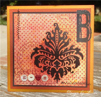
#1. In the above photo, you can see that I started with a plain piece of white cardstock again. The first step was to ink the damask image with black ColorBox ink and then it was stamped on the white paper. It was embossed with black embossing powder. The ink in the ColorBox pads is a pigment ink and what that mostly means is that it is an ink that stays wet longer allowing time to pour on the embossing powder, etc. I embossed it because that will make the image a little stronger in color and it will allow it to resist the other supplies that I am going to use on it.
#2. For the next step, I took my "dot" stamp and inked that with the Ancient Page red stamp pad (in the above example I used black ink for the dot image but that was so that it would show up well in the photo so you could easily see what was done). It was stamped so that it would cover the piece of paper, stamping it right over the embossed image. I needed to ink it and stamp that stamp twice to cover the paper. A different kind of ink was used for this stamp because it needed to dry a little faster then the ColorBox ink.
#3. Here is where my favorite sprays came into play again. First of all, the paper and images were given a light coat of the yellow spray, taking care to not completely cover the paper. Next came the red spray, again not covering the paper completely with the red. This gives a nice mix of the yellow and the red.
#4. For the finishing touches, you can see three different stamps that were stamped in a rust colored ink. These are very subtle images, just giving the slight feeling of writing and postmarks. Buttons were sewn on and two lines of zig zag machine sewing provided fun accents along with the big rub-on "B".
You can see where there is a little more red color around the edges of the black damask image. Because this image was embossed, it resisted the inks and sprays. I left this piece so that these would dry but they didn't completely dry and so I took a soft cloth and rubbed the black image dry and that smeared the red ink a little bit.
Thanks for visiting, Linda (lbpost)
SPRAY BACKGROUND - DAMASK card
Materials list:
Cardstock – Prism
Dot stamp – Stamp Camp
Damask stamp – Inkadinkado
Postage cancellation stamp – Stampington
Writing stamp – Crafty Secrets
Love and Kisses stamp – RubberStampede
Postmark stamp – Stampington & Co.
Stamp pads – Ancient Page/Clearsnap
Black embossing powder – Top Boss/Clearsnap
Black Colorbox pad – Clearsnap
Yellow and red spray color – Memories Mists
Rub-on letter – Autumn Leaves

Sunday, October 5, 2008

Creating Backgrounds PART 5 - Emerging Color & "give away" winners

First order of business today is to announce the
winners of my little "give away"!!!
Congrats to:
Kimberly A. & Cassie
I have emailed each of you and thank you so much to all of you amazing gals who played along. It was sooooo hard to just not pick everyone!

The background technique I wanted to share with your today is called "emerging color". I don't think I had really paid any attention to this until I found it on Ashley Bowen's blog, Ashley's Creative Corner. Her example is just stunning and I knew right away that I had to figure out what she did. She points crafters to a tutorial at SplitCoast Stampers, so that is where I got my information of what to do. I wanted to break down the steps I took to create my card because this kind of a technique is better understood with pictures.
The biggest trick to this technique is trying to figure out what stamps to use to make it work. You need at least two stamps that are going to somehow coordinate and one of them needs to have a rather large, flat surface. So, you need a stamp or stamps to create your background with small stamps and then you need another stamp that can be stamped over the small, background images.
#1. I stamped my branch stamp by inking it with the Marvy stamp pad and I spritzed that each time with the fine mist of water so that my stamped image had a watercolor look. The watercolor effect was just the look I wanted, not something that would be required.
#2. I inked my solid pear stamp with the Watermark stamp pad and embossed it with clear embossing powder. I pretty much filled up my paper with the yellow, branch stamp that way wherever I stamped my pear, there would be plenty of leaves underneath it. I decided on where I would want my pear to be on my paper and stamped it once.
( If you look real close, you can see the clear, embossed pear in the above image. This has to be done with the clear ink and embossing powder because you want the underneath images to show through in the end.)
#3. Now I took my red stamp pad and rubbed it directly across my stamped paper and across my clear, embossed pear. You can see where the term "emerging" comes from as the clear pear and the underneath stamped leaves instantly are revealed. There would be other ways to apply the stamp pad ink, I rubbed the pad directly to my paper until it was colored with a solid coat of the red ink.
#4. After you have completely colored the paper with your color, take a soft cloth or Kleenex and whip the ink off of the clear, embossed image. If effect, you are polishing it.

I added a few other stamped images to my finished card.
This close up gives you an idea of how dramatic the finished work is.
Thank you for visiting, Linda (lbpost)

ENJOY - PEAR card
Materials list:
Cardstock – Prism
Broad leaf stamp – Paper Source
Solid pear stamp – Stamp in the Hand
Flourish stamp – Crafty Secrets
Border punch – Martha Stewart
Ribbon
Watermark stamp pad and clear embossing powder – Clearsnap

Ancient Page stamp pad in Henna - Clearsnap
Brilliant Yellow stamp pad – Marvy

Sunday, September 28, 2008

Creating Backgrounds PART 4 - Sprays

Have you ever played with Prima Paintables? I love these things. What I love the most is the kind of paper that they have used, it is an amazing watercolor paper. It is the kind that allows you to play and play with water and it holds up well. I have even used the back of the paper when I wanted to watercolor my own image.
The above piece is the one that I used for my two cards. It has four sections of prints on this one sheet of paper making it the perfect backdrop to card making. I just cut it in fourths so I could work with each design separately.
The background in the card above took all of a minute to create! I just used my Memories Mists sprays. (I seem to be finding way too many things to create with them) I used the yellow and the red and sprayed the yellow first. The usual rule of thumb when working with different colors is to start with the lightest color first. I didn't want either color to cover the entire piece and these sprays are great for giving a nice, fine mist that lets you only color portions of your piece.
In this close-up, you can see the yellow with a fine mist of the red over that. I used my watercolor crayons and watercolor brush to add red to the middles of each of the flowers and I added an accent dot to each middle with the Inkssentials white pen. The little label was also lightly sprayed with the yellow so that it fit in better. To finish this fast and easy card off, I just added a punch out black chipboard piece from Cosmo Cricket. I just love using the black chipboard, it is so dramatic without any work. Mini brads accent the middles of the chipboard flowers.
For the above card, I got a little more involved with my sprays and accents.
If you look at my original piece, you can see that the crown is part of the pattern on the paper. I used the white, Inkssentials pen and accented the designs with lines and dots.
You can also see in these two close-ups how I kept the purple and the yellow sprays somewhat separate on the piece. A rub-on greeting and some various stamps stamped in a collage style finished the card off.
Thanks for visiting, Linda (lbpost)
BLESSINGS ABOUND card
Materials list:
Cardstock
Patterned papers – Prima Paintables
Bracket stamp – Inkadinkado
Label – K&Co.
Black Chipboard flower – Cosmo Cricket
Brads
Memories Mists sprays – Stewart Superior
White pen – Inkssentials/Ranger
White dimensional paint – Tulip
Rub-on words – Deja Views

MAGICAL-UNIQUE card
Materials list:
Cardstock
Patterned papers – Prima Paintables
Yellow Memories Mists – Stewart Superior
Purple Glimmer Mist – Tattered Angels
White accent pen – Inkssentials/Ranger
Rub-on word – Luxe
Word stamps – Wordsworth
Rhinestone

Monday, September 22, 2008

Creating Backgrounds - Part 4 - Brayer Fun

Have you even played with a brayer? Maybe you don't even know what one is. Maybe you have one sitting there that you haven't picked up. There are actually a number of techniques that can be done with them and I would like to cover one of my favorites today. There are also a number of different brayers, mine is a Speedball. These have been used for years in printmaking.
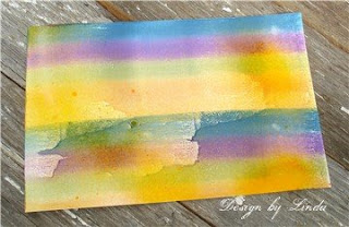
#1. I love to use these Kaleidocolor stamp pads with the brayer. The reason is that they are multi-colored and these particular pads have some rather clever features that make them long lasting and easy to use. This photo above is the pad as it looks when you remove the lid. The colors are stored "separate". In the past, multi-colored pads were just one pad with different colors on them and it wasn't long and the colors would just run together, making for a rather muddy look. These pads have a lever that separates the colors, you can't put the lid back on without pulling the lever to separate them.
#2. When you go to use the pad, you push the lever and the colors are pushed together to form one solid pad. In the photo above, you can see the pad with the colors pushed together and you can see how I have placed my brayer on the pad. You want to ALWAYS place the brayer back in the same direction on the pad. So, the end that started on the green end, always needs to be placed back on the green end. If you reverse the brayer or a stamp you are using, you will transfer the colors onto each other and that doesn't work well. If you do that (I am speaking from experience here) you can take a cloth and just wipe the pad and alot of that transfered color will be removed.
#3. I like to completely cover the brayer with colors by running it over the pad several times and then I use a small, misting bottle and spray the brayer. You can see by the above photo, the look that comes with the water and the inks mixed together. I am also using glossy paper here. This also works with uncoated or matte papers and I will show some of that later.
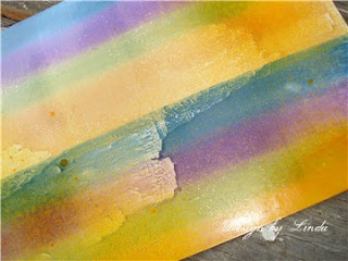
#4. Here is a piece of paper with the brayer run across the paper with two widths of the brayer, so it is run across twice. I only ran the brayer across once too but you can continue to re-ink it and run it across over and over until you have the color you want. I wanted to make sure that my inks showed well as they ran with the misting of the water.
The photo above shows a good close-up of that paper and the effect.

When you have your paper colored, there are a number of things that can be created with the finished and dry multi-colored paper.
For the card above, I just stamped a stamp over my colors using black ink. This stamp has all of these images in one piece.
I added some Glitter Fabric Dimensional paint to the flower portion only, I think you can see a little bit of the sparkle in this photo and another interesting thing is that the paint "raised" the paper in that area so it has an embossed look to just the flower.
One of my favorite things it to just stamp a background design over the colors. This leaf swirl stamp was a great choice with these fall colors.
I also used some of my colored paper to stamp my greeting and notice that I stamped the greeting with the line of colors going in the opposite direction of the colors on the background.
Thanks for visiting, Linda (lbpost)
SING TO THE LORD… card
Materials list:
Glossy cardstock
Cardstock
Creole Spice Kaleidocolor stamp pad – Tsukineko, Inc.
Leaf background stamp – Inkadinkado
Verse stamp – Printworks
Black stamp pad - Versafine

FIRST GRADE card
Materials list:
Glossy cardstock
Cardstock
Patterned paper – BoBunny Press
Bouquet Kaleidocolor stamp pad – Tsukineko, Inc.
First Grade stamp – PaperBag Studios
Black stamp pad – Versafine
Glitter Fabric Dimensional paint – Tulip
Machine sewing
Scallop scissors