Showing posts with label Kitchen Sink Stamps. Show all posts

Monday, November 22, 2010

Voting and Stamping

As for the voting, will you vote for me at Sketchy Thursday if you have a minute? The voting goes until Wednesday and it is for being the December Guest Designer which I think would be so fun.
Now for the stamping part of my post.
The sponsor this week at Card Positioning Systems blog is Kitchen Sink stamps. Her stamps are always some of my favorites to work with.  And to make the stamps that I used this week even more fun, I was on the lookout this fall for some great, "go to" leaf stamps and I found them!!! LOVE this set, it includes a number of leaves all in the 3-4 step process that makes Kitchen Sink stamps popular.
The Kitchen Sink stamps are designed to use in her 3-4 step process but what I discovered about these leaf stamps if that you don't always have to use all of the layers.  The golden yellow stamps that created my background here are only one of the layers.  Another interesting thing about these leaves is that for the orange/brown ones, I used the second leaf in the set and the third and I used the same color ink for each layer. They are designed to use all three or four layers and to use different shades of ink for each layer to create the finished image. 
Another interesting accent to this card is that I used a piece of Core'dinations from The Chocolate Box collection. That means it is brown on the top side and the core and reverse side is red.  I used my Martha Stewart score board to score the lines in the bottom portion of the card and then sanded them to expose the red core.  A fun, easy and inexpensive technique. 
Now for a more Christmasy style of card, I used another leaf in the same set. 
This time I used all three layers and a different shade of ink for each layer.  I then sprayed over the piece with a green Glimmer Mist. 
 A close-up of the three layers. 
Gotta share a few photos too...
We pulled out the Halloween costume again to get some photos of the costume in the daylight.  This is the famous Dino-Bubbles slayer!!! He was very specific that he wanted to be a dinosaur with a sword.  His big sister pulled out the bubbles to help keep his attention while Grandma snapped the camera.
It is pretty funny too because our puppy dog thinks she is part of the action!!!

Our fearless Bubble Slayer!!!
Thanks for visiting, Linda (lbpost)

SKETCH 194 – THANK YOU card

Materials:
Stamps – Courtesy of Kitchen Sink stamps
Cardstock – The Chocolate Box/Core’dinations
Memento and Distress stamp pads
Martha Stewart Score Board
Corner rounder punch – Fiskars
Self adhesive rhinestones - Recollections
Sandpaper
Foam tape

SKETCH 195 – HOLLY JOLLY CHRISTMAS card
Materials:
Stamps – Courtesy of The Stamps of Life
Cardstock – Core Essentials/Core’dinations
Patterned paper – Winter Wonderland/Echo Park Paper Co. (both sides)
Black Versafine stamp pad
Clear embossing powder - Stampendous
Copic markers
White pen
Foam tape

Monday, September 20, 2010

A Stamp here and a Stamp there

Todays post is about some really fun stamps. Fun in design and fun to use.
The first card I want to share is this cutie created with My Stamp Box stamps.  Core'dinations cardstock and My Stamp Box did an exchange and this is one of the cards I put together with these stamps. I LOVE this set of stamps, how does it get better then patterned clouds! Be sure to check out both of those blogs, Core'dinations and My Stamp Box, for more ideas, both teams created cute stuff and there are prizes to be had by leaving comments on both blogs.
For this card I did an exercise with masking. 
If you don't know what masking is, it is a technique that allows you to stamp more then one image and have one look like it is "behind" the other or one "on top" of the other, whichever way you look at it. 
1.  I stamped the sun first. 
2.  Then I stamped the sun on a piece of copier paper (you need a thin paper for a mask).  I cut that extra sun out.  Now that cut out sun is placed over my original sun and one of the clouds was stamped, inking it with black ink.  Where the sun mask is, the cloud image will not stamp and when the sun mask is then removed, you will see the sun looking like it is "on top" of that cloud. 
3.  I then made a mask of the first cloud, I placed the sun mask and the cloud mask over the images I had stamped and I stamped the second cloud.  Now my sun and the first cloud look like they are "on top" of the second cloud. 
4.  I kept those two masks in place and sprayed my white cardstock with some Glimmer Mist spray, first a blue Chalkboard spray and then a blue Glimmer Mist spray to create my "sky" behind the sun and clouds.  This kept the spray off of the sun and clouds. 

The sun is accented with a little bit of Glitter 3-D Fashion Paint for just the right amount of glitter.

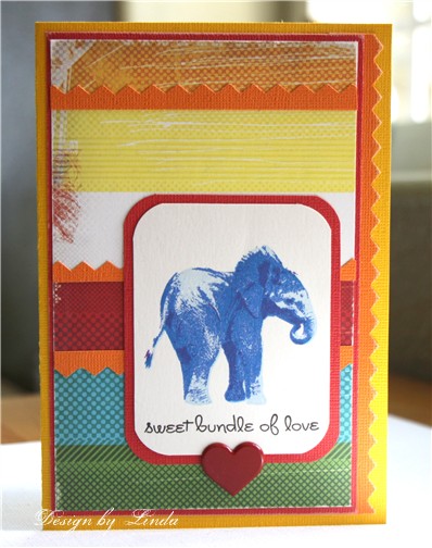
Next I want to share my Card Positioning Systems card for this week.  The sponsor is Kitchen Sink Stamps.  If you are not familiar with that company, it is known for it's 3 or 4 step stamping process.  I just don't even know how she does it, but by stamping the layers, you keep adding details that are pretty hard to believe are stamps. 
This is one of her brand new stamp sets.  This little elephant is just too adorable.  I chose to stamp it in shades of blue so that it would fit for a baby card.  The set comes with a number of adorable little sentiments to go with it.  I just love the font she uses. 
One thing about using these stamps is determining what colors to use for the layers.  It works best to start with a very light shade and then each additional layer should be darker and darker.  For my last layer on this little guy, I used a purple that really helped define the cute details.  I listed the exact shades I used in my materials list.
Thanks for visiting, Linda (lbpost)

RAINY DAY? card

Materials list:
Cardstock – Vintage and Core Essentials/Core’dinations
Curious Iridescent Cryogen White/CutCardStock.com
Clouds, sun and sentiments stamps – My Stamp Box
Black Versafine stamp pad
Clear embossing powder
Tattered Angels – Glimmer Mist and Chalkboard
Sandpaper
Self adhesive rhinestones – Queen & Co.
Copic markers
Glitter 3-D Fashion Paint – Tulip


SKETCH 185 – SWEET BUNDLE OF LOVE card

Materials:
Cardstock – Core Expressions/Core’dinations
Elephant and sentiment stamps – Courtesy of Kitchen Sink Stamps
Patterned paper – Cosmo Cricket
Versafine black stamp pad
Memento stamp pads - 1. Summer Sky, 2. Bahama Blue 3. Danube Blue 4. Grape Jelly
Heart brad - Recollections
Corner punch – Martha Stewart
Sandpaper

Saturday, July 17, 2010

Dolls, dolls and more dolls

I am going to share my Unscripted Sketch card for this week and my Card Positioning Systems card in todays post and both have the cutest little dolls on them.
This card uses the Unscripted Sketch #64. You might already know I am a huge fan of sketches so it is always fun to work with another one. Make sure to check out this sketch and maybe even give it a try. I thought the colors pretty much worked with the Colour Q challenge #41 too.
I am madly in love with My Favorite Things Pure Innocence images. These little gals are just so precious. Recently I found someone on the web that stamped one of these images in just black ink on white paper and I had to give that look a try. I so wish I could remember who did it so I could credit them for their brilliant idea! It almost gives it a comic book look to me.
Notice the card base. It is a piece of BasicGrey from the Olivia collection. When I first saw this new collection the other day, I knew I needed every single piece! The fun thing about using a piece of patterned paper for the card base is that this piece is 2 sided so the inside of the card is also patterned.
Onto my next card...
Kitchen Sink stamps is the sponsor for this next week at Card Positioning Systems blog. I LOVE their stamps so it made me very happy to pick out some stamps to work with. I just LOVE this set of nesting dolls. Again, I used the Olivia collection of papers by BasicGrey.
I wanted to color them very simply so I basically used just shades of two colors on each one.
***
Gotta share more photos! I seem to be clicking that button on my camera constantly lately so I have so much to share.
When I visited that park where the baby ducklings were, there were also lots of amazing plants. Many I have never seen before and this is one of those. The flowers are these amazing orange/yellow blooms.
These unbelievable green parts are one of the stages of this plant.
Here is the bloom along with the interesting green parts.
This is one of the last stages of this same plant. Dried up pockets with seeds inside. All of these stages were on the one plant all at the same time.
This was another plant, these appeared to be what was left after it flowered.
Thanks for visiting, Linda (lbpost)

SKETCH 64 – BIRTHDAY GIRL card
Materials:
Cardstock – Core Impressions/Core’dinations
Patterned paper – BasicGrey
Stamps – Pure Innocence/My Favorite Things
Black Versafine stamp pad
Clear embossing powder - Stampendous
Heart brad – Creative Impressions
Circle punch – Papershapers
Foam tape – 3M
Sandpaper


SKETCH 176 – HAVE A HAPPY DAY card
Materials:
Stamps courtesy of Kitchen Sink – Nesting Dolls set
Black Versafine stamp pad
Clear embossing powder – Stampendous
Cardstock - Core Expressions Core’dinations

Patterned paper – BasicGrey
Corner rounder punch – PaperShaper
Cuttlebug embossing folder
Self adhesive pearls – Queen & Co.
Copic markers
White 3-D Fashion paint - Tulip
Sandpaper
Foam tape – 3M

Thursday, February 5, 2009

CPS and Kitchen Sink Stamps

It is still party time at Card Positioning Systems blog and we have THREE sponsors this week. The stamps that I was able to play with are created by Kitchen Sink Stamps. LOVE these things. One of the interesting features of many of the stamps at KSS is that they use 3 or 4 steps to create the final image. I love the depth that is achieved with these steps. I played with an adorable set with some completely adorable little chicks and eggs on it and a bonus set of shells.
There are a couple things you have to remember when working with these Kitchen Sink Stamps.
1. PLAY - you have to use various stamp pads to find the combination of colors that will build on each other. I just sit and stamp my images several times with several different sets of inks to find what I think works for my needs at that time. I mix brands of inks too, this seems to work just fine and maybe better.
2. The colors are going to "blend" or "melt" together as they sit. SOOOO, work on your creations and then walk away and let them sit. You will be amazed when you return at how the inks work together.

This is the card that I created to go with Sketch #101 for Card Positioning Systems blog for this week. What a fun sketch and how cute did this little chick turn out?!
In the close-up, you can get a better view of the layers of inks as each step was stamped. I also used a great set of Labels Two Nestabilities by Spellbinders for my little design element. These not only cut by they emboss and they come in sizes that are made to go together. Another thing to notice here are the little green, metallic spots. I masked my little chich after she was stamped and then gave one quick spritz of my favorite green Glimmer Mist.
Here, I used sketch #50 from past sketches at CPS so that I could use this adorable chick again and I used a slightly different set of inks. You can also see the little greetings on there two cards that are also stamps by KSS, I just love the font she uses.
Here is a better view in this close-up. I used some colors that were a little more intense for this chick.
I LOVE shells and so I just had to create an example so you can see how amazing these stamps turn out. Again, these are stamps that work in steps and in this set there are actually some that use 2 steps, some 3 steps, some 4 steps and actually one that uses 5 steps. Talk about detail!!!
Notice in the close-up that I decorated the entire background of my little calendar with very subtle stamping. Here I just used one or two of the steps so that I had shadows. For my main shells, I also did some of the steps more then once in more then one color. Because these stamps are clear, you are able to see exactly where you are going to stamp, that is what makes these steps possible but that also let me re-stamp some and that just added more definition to the amazing details in the stamps.
Thanks for visiting, Linda (lbpost)
SKETCH 101 – HEY CHICK card – Kitchen Sink
Materials:
Stamps courtesy of Kitchen Sink Stamps – 3-Step Hey Chick
Cardstock – Cut Card Stock
Patterned paper –Greenhouse/Making Memories
Various stamp pads
Nestabilities – Labels Two/Spellbinders
3M foam tape
Ribbon
Glimmer Mist – Tattered Angels

Tuesday, November 11, 2008

Thursday, September 18, 2008

This Just In......

Today was my day to post a project at Pursuit of CraftYness so I did another project with the Kitchen Sink Daisy stamp set and some tips on stamp pads, etc.

Take a peek:
The Art of Stamping Flowers

Thanks for visiting my blog and the Pursuit of CraftYness blog, Linda (lbpost)

Wednesday, September 17, 2008

So You Think You Can Stamp contest

I already mentioned this, but I thought I would post my layout for the contest here and give you a good peek at a close-up of those YUMMY flowers! The voting is still open until Thurs at noon and I understand you can vote for more then one entry. There will be several stampers who will move onto the next phase with more voting next week.
Voting here - So You Think You Can Stamp contest

This is my granddaughter when I caught her using her mom's camera. It is so fun to see the interest in photography being passed on to my kids and then to their kids.
I wanted to give you a real close up of the flowers. I used this great set by Kitchen Sink Stamps. She has several sets of stamps that are referred to as 3-step stamps but if you count stamping the middle to this larger Daisy, there were four steps. Each layer of stamps just adds more and more details to the image, each time using darker stamp pad colors. And for these flowers I used Worldwin papers, Treasures cardstock in white and you can see the "canvas" look that gives to the flowers.
Thanks for visiting, Linda (lbpost)

YOUR VIEW layout
Materials: Cardstock
Patterned paper – HomeTown collection/October Afternoon
Kitchen Sink Stamps – Daisy 3-step set
Memento stamp pads
Vivid stamp pad
Marvy stamp pad
Ranger Distress stamp pad

Monday, September 1, 2008

Creating Backgrounds - PART 1

The market is flooded with patterned papers and I basically love them all BUT...you can also create your own background papers. There are so many kinds of coloring mediums, mix those with some stamps and you can come up with a look that is custom. I am going to take you through a few simple steps today for creating a neat look that is really very easy and it started with plain white paper.#1. Take a piece of plain, white cardstock. I used a swiss dot background stamp by Stamp Camp. It was stamped with black, ColorBox ink and then embossed with black Top Boss embossing powder. The ColorBox ink is a pigment ink meaning it is great to use for embossing because it stays wet for awhile allowing you to pour on the powder, etc. I didn't have to emboss my design but the embossing does give a great look to the dots, they are now raised and that also allows the dots to stand up against the painting process I am going to do.
#2. To color my background, I used these pearlescent paints by UsArtQuest. They are basically pearl ex powders in a form that works by just adding water. They come in this little palette as pictured. I used a water brush to paint my paper. I LOVE water brushes!!! They have a barrel that contains water and they are ready at any instant for watercoloring. The dried paints need a little more water then what is going to come out of the brush, however, so I did squirt some water directly into the paint too. I just kept adding paint with the brush until my paper was coated. When the paint was dry, I buffed it with a soft cloth so that my shiny, embossed dots would show up well.
#3. Now for a little added interest, I used this purple Glimmer Mist by Tattered Angels. You do have to shake the container very well before using because the metallic portion of these inks settle very quickly in the bottom of the bottle. I didn't want a lot of this ink so I just did a little squirt at two of the corners.
#4. I also wanted to show here that when the bird is stamped on white cardstock, the bird is black because of the color ink I used and the flowers are white because the paper is showing through those places. I then added color to the flowers with the same watercolor brush and pearlescent paints.

This is my finished card.
I hope you can see the shiny black, embossed dots and the pearlescent look of that paint.

Thanks for visiting, Linda (aka lbpost)

THE ROAD TO A FRIENDS HOUSE card :
Materials list:
Cardstock Dot stamp – Stamp Camp
Bird stamp – Inkadinkadoo
Pearlescent Stargazers – USArtQuest
Glimmer Mist - Fully Purple/Tattered Angels
Fancy Label – K&Co.
ColorBox stamp pad – Clearsnap
Top Boss Black embossing powder – Clearsnap
Greeting stamp – A Muse Rubber Stamps
Watercolor brush - YASUTOMO

Tuesday, August 5, 2008

Some Flower Yum!

YUM & YUMMINESS and variations thereof must be my new "go to" words!

Anyway, the cards I'm going to share with you today were created using Kitchen Sink Stamps and HELLO!, just the name of the company alone makes you want to use these things! They were the sponsors for Card Positioning Systems blog when we did Sketch #73 and can I tell you, I quickly feel in love with them. The set I picked to work with includes some Hibiscus flowers and some words or phrases. The deal on these stamps is that they are 3-step. You are going to stamp what looks like one flower but with three different layers. WOWIE, does that ever make the flower come to life. (their images don't just include flowers with this same process) The hardest part is to figure out what stamp pads you have that will work for the three shades, one needing to be very light, the last needing to be rather strong. I just played for awhile to find out what pads were going to work well. I actually ended up using stamp pads from different companies and with different kinds of inks but they still worked together. Another interesting note is that after you have finished stamping and you image sits for awhile, the colors seem to melt together.


For this card, I stamped the flower and the two sizes of leaves and then I created a mask of the flower so that it would be covered and I stamped the words over that. A mask in this case, makes the flower then look like it is sitting on top of the words when in reality I stamped that first.
For this card, I found these amazing papers just sitting on my desk as scraps from other projects and they were just the perfect colors for bringing out the single stamped flower. The card base is a printed vellum. It has a second white cardstock card inside of that for added sturdiness.

On this card, I stamped my flower and leaf and then cut them out. My background is created with random stampings of the smaller flower in the set and then my cut out pieces were added with foam tape. I love the dimension that is added when some pieces are placed on the card with the foam tape.

Thank You for Visiting, Linda (aka lbpost)

DEAR FRIEND card - Materials:
Rubber stamps courtesy of KITCHEN SINK STAMPS
3 step Hibiscus set
Cardstock
Stamp pads – Ancient Page and Fluid Chalk/Clearsnap
Cuttlebug embossing plate – Provo Craft
Ribbon

HIBISCUS FLOWER card - Materials:
Solid Cardstock
Patterned paper – Scriptease Screen Prints/Hambly Studios and Scenic Route
Three step flower stamp – Kitchen Sink stamps
Stamp pads – Ancient Page/Clearsnap
Rhinestones – Mark Richards